Coosh
Brand emblem that people desire to wear.
Context
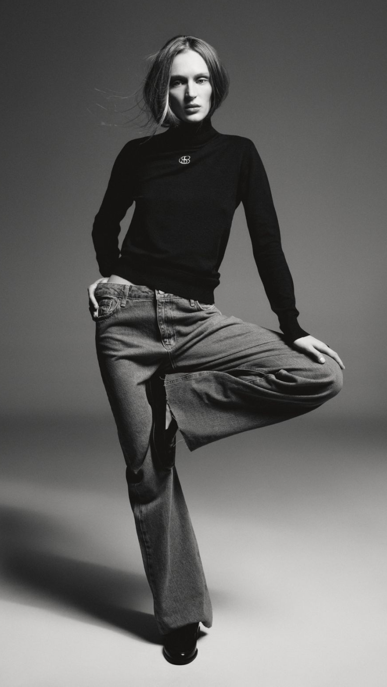
Coosh is a ready-to-wear brand for modern, self-assured women. The founders' conviction is simple: clothing should reveal personality, not replace it. The founders describe their philosophy as minimalism that puts focus on the person wearing it, treating garments as a frame for character rather than a statement on their own. When the team approached Orchidea, they already had a typographic logotype they were committed to. What they needed first was an emblem iconic enough to represent the brand and strong enough to carry across physical product, from metal hardware to embossed garment prints. Beyond that, a typographic system and visual language to hold everything together across digital and physical touchpoints.
Challenge
The emblem had to be something people want to wear. A mark refined enough to appear as a metal clasp on a coat or an embroidered detail on a knit, while working at 8mm on a garment tag and at full scale on a billboard. It needed to encode sophisticated minimalism without becoming a generic mood board reference.
Visual Direction
We took our inspiration from modernism. Simple circles, clean intersections, and deliberate negative space are how modernist designers achieve visual clarity without sterility.
Modernist furniture, architecture, and graphic design all confirm the same principle. When we looked at the word "Coosh" through that lens, one thing stood out: five letters, four of them round. Circles and ovals. That was the starting point.
Symbol
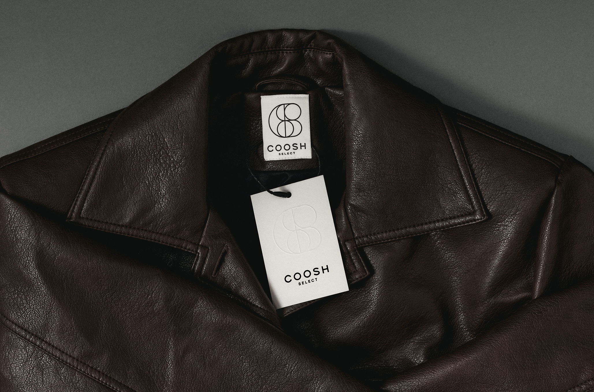
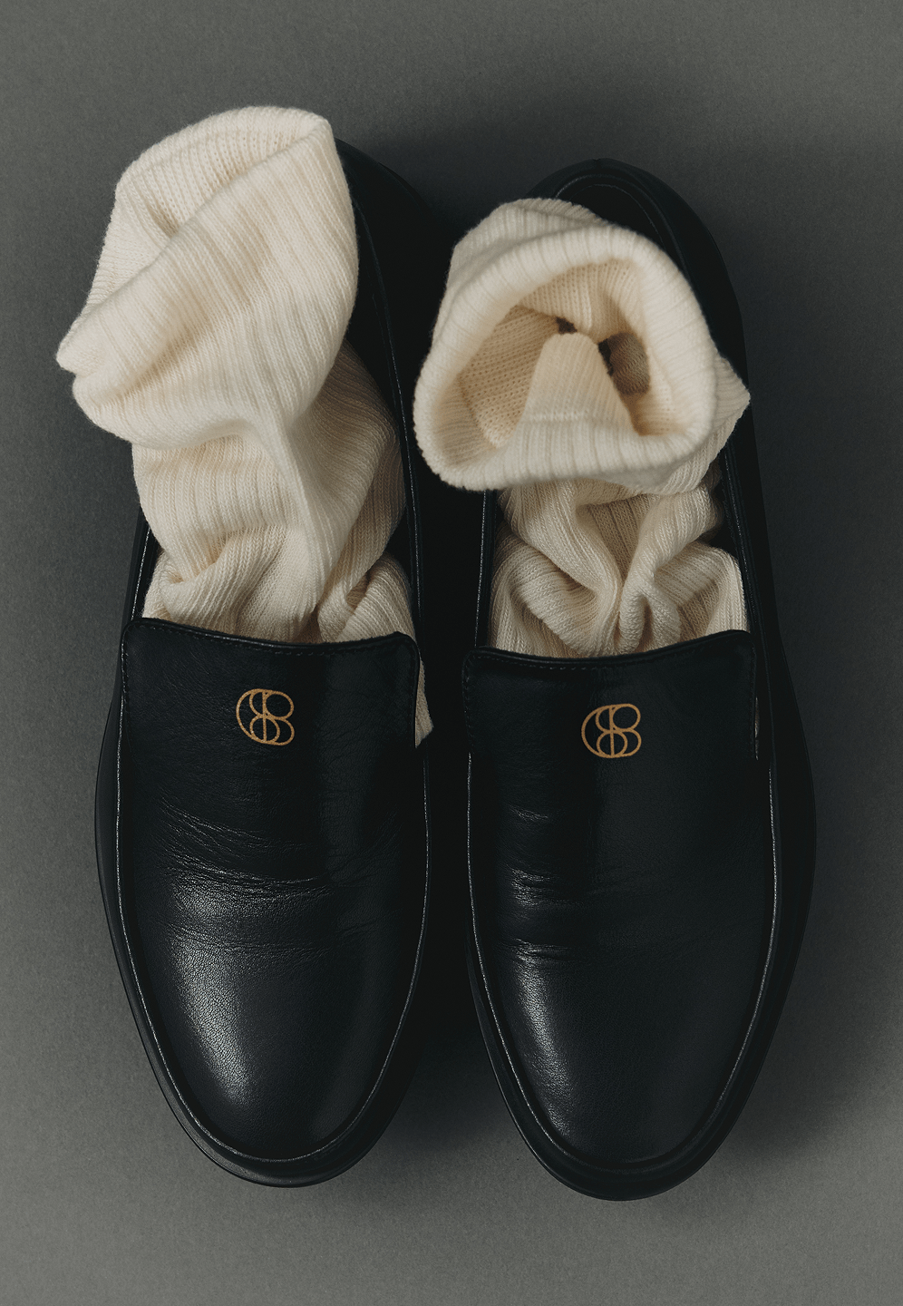
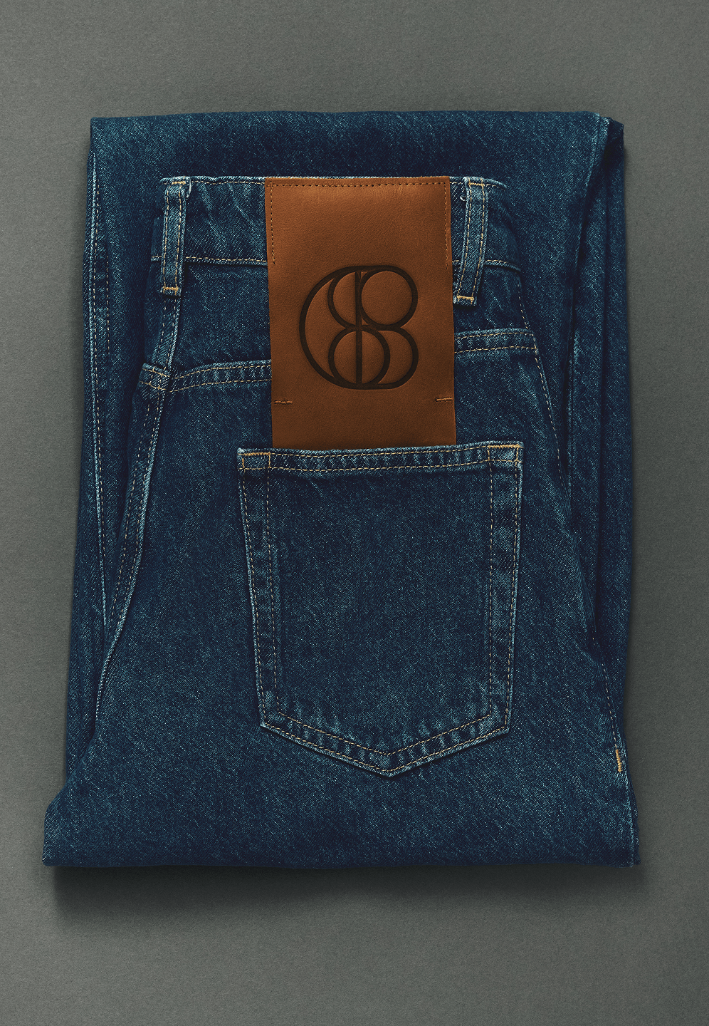
The emblem is constructed from the brand name itself. Every line traces back to a letterform. Abstract geometry at first glance, the full name revealed on closer look.
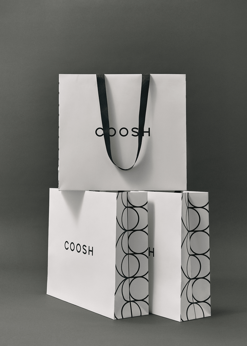
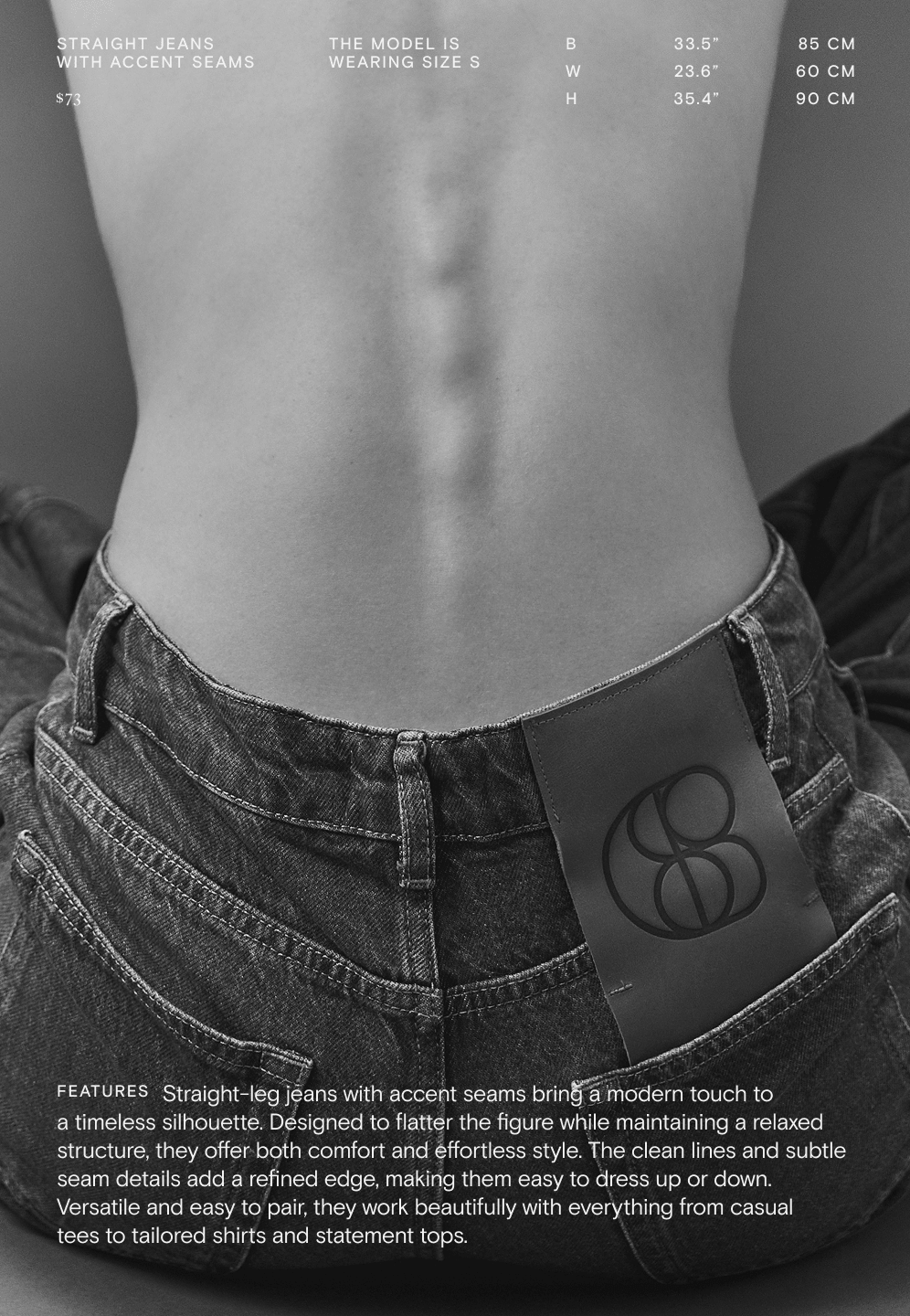
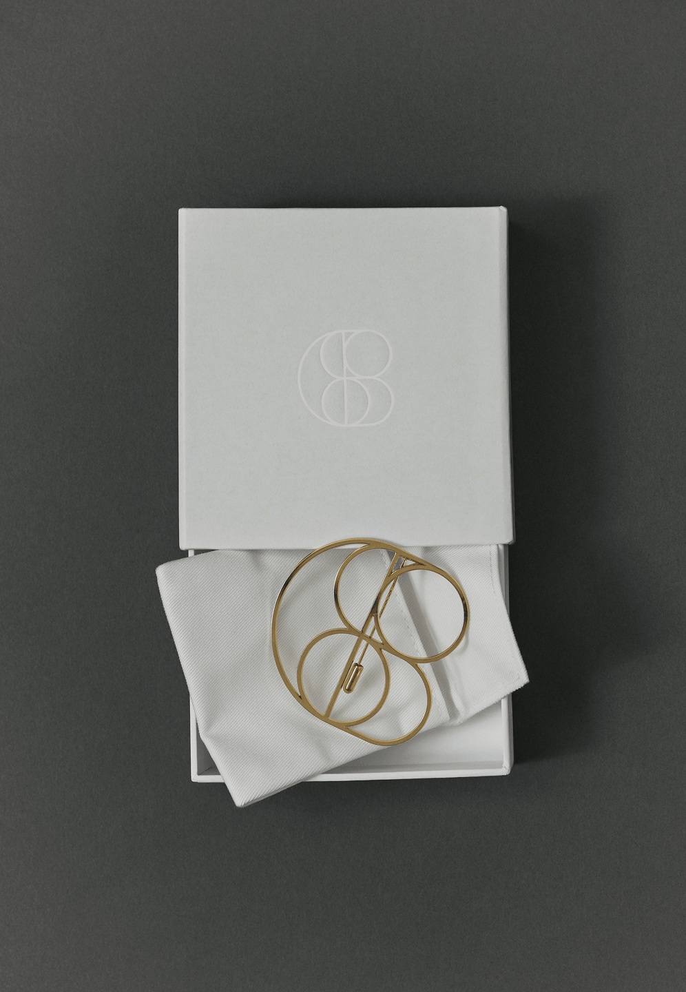
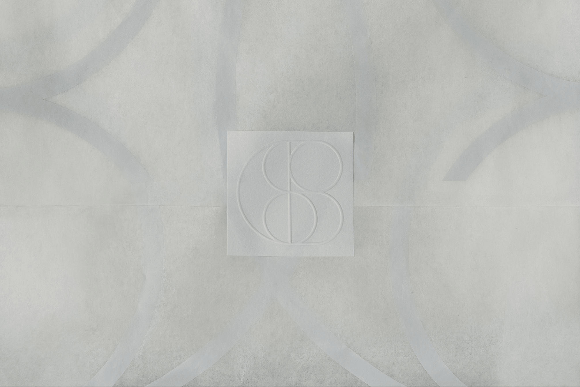
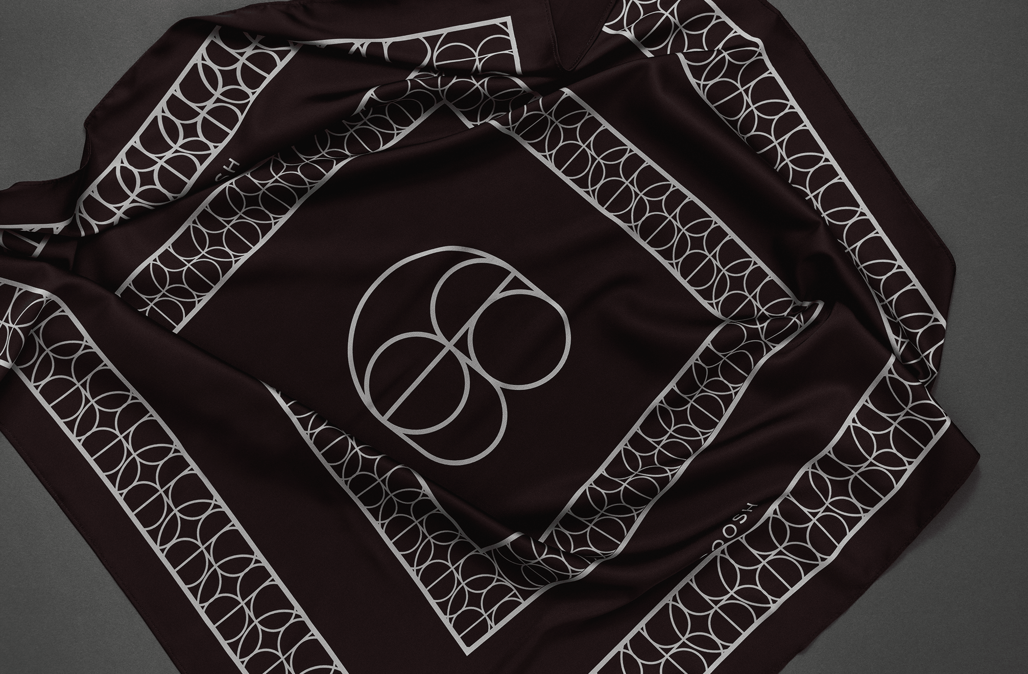
The letter "C" wraps around the double "o," while the "S" flows between them as a connecting gesture. The "H" is hidden inside the structure, its vertical and horizontal strokes providing architectural stability to what would otherwise be a purely fluid form. The second guiding idea was scalability across all touchpoints. At small sizes on woven labels or embossed leather, the clean geometry holds. Produced in metal for brooches, clasps, or belt hardware, the simple intersecting lines translate directly into manufacturing. Repeated as a grid, the symbol becomes a rhythmic pattern for tissue paper, dust bags, or textile prints.
Typography System
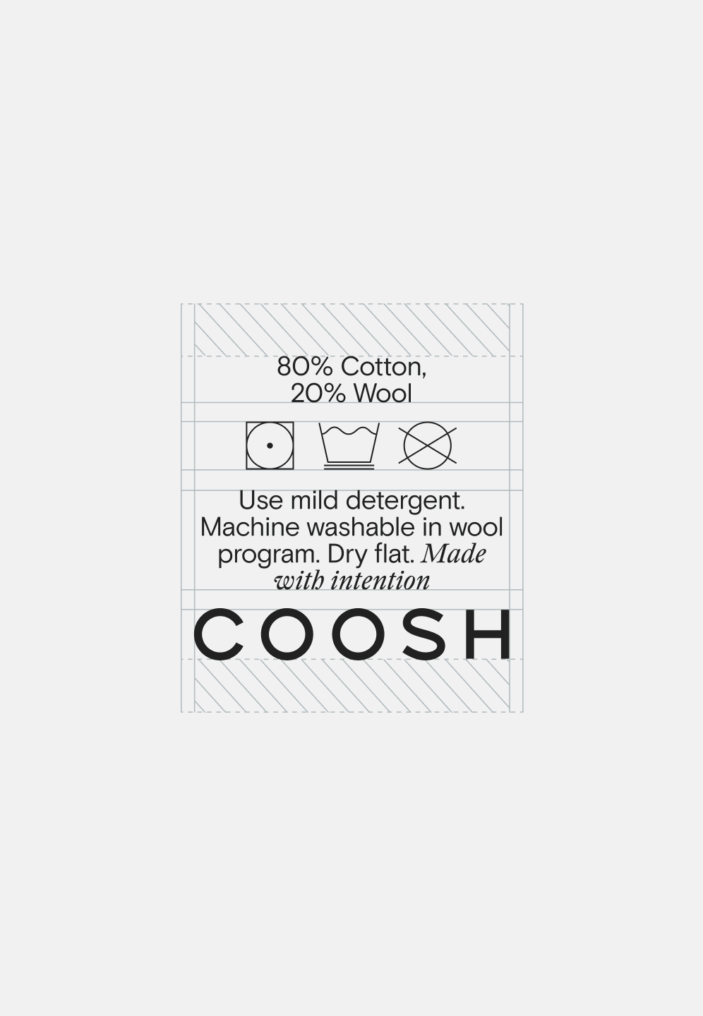
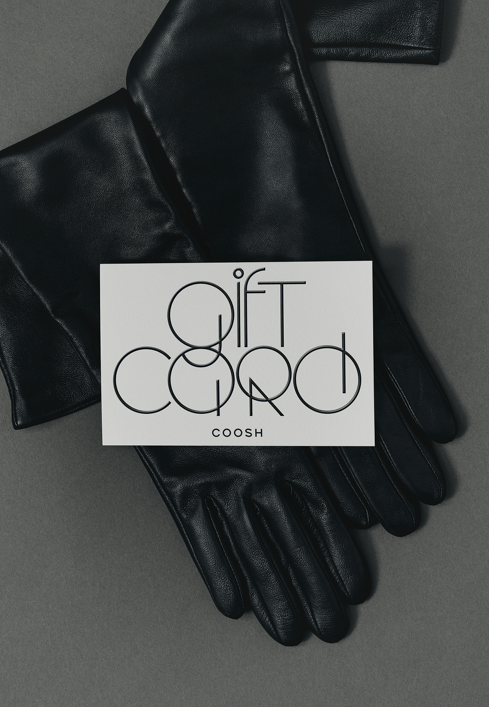
We built the type system on three layers, each doing a different job. The primary typeface is a rounded sans serif, calm and legible, carrying the same geometric DNA as the symbol. Alongside it, an elegant serif adds contrast and signals refinement in editorial contexts and lookbook layouts. The third layer is an experimental display typeface whose letterforms directly extend the logic of the symbol: round, geometric, slightly unexpected. This display face appears in campaign visuals, seasonal posts, and printed materials where the brand can afford to be more playful. Together, the three typefaces create a range from quiet to expressive while staying inside a single visual system.
System Thinking
The identity was designed to scale. From Instagram grids to hang tags, from packaging tissue to outdoor advertising, every element shares the same proportions and geometric language.
The experimental typeface and the symbol pattern give Coosh tools for seasonal variation without breaking consistency. The serif and sans serif pairing keeps day-to-day communications polished and readable. This is a system built for a brand that operates across physical and digital simultaneously, which is the reality for any fashion label selling direct-to-consumer and through retail.
Result
Most brand marks live on guidelines documents. This one started generating revenue on its own.
Coosh started launching emblem-based products, printing and embroidering the symbol across garments, accessories, and hardware. The mark became visible on the street, on people, turning a brand asset into a recognition engine that works without a marketing budget attached to it.
Credits
Valeria Shaposhnikova
Creative direction
Alexandra Romanenko
Art-direction & Brand design
Kateryna Sienko
Photography
Services
Brand Identity
Emblem
Merchandise
Social Media Kit

.png)