.png)
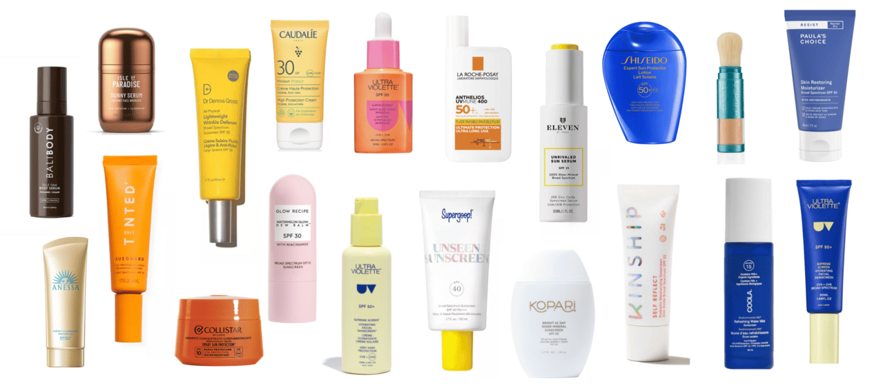
Thousands of skincare brands launched SPF as line extension. La Roche-Posay, CeraVe, Shiseido, Paula's Choice. But these products are extensions built into existing brand DNA. They're not changing positioning or appearance for sun protection category.
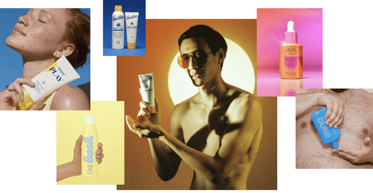
We're examining Sunscreen Brands—companies that sell the dream of bronzed memories, sun-kissed vacation mood, and aspirational lifestyle rather than clinical UV protection. These brands understood something crucial: people don't want to think about melanoma risk when buying beach products. They want to think about fun, relaxation, carefree summer days.
That emotional repositioning unlocked different price points, created category loyalty, and turned commodity sun protection into lifestyle accessory.
Vacation: find differentiation point, become trendsetter
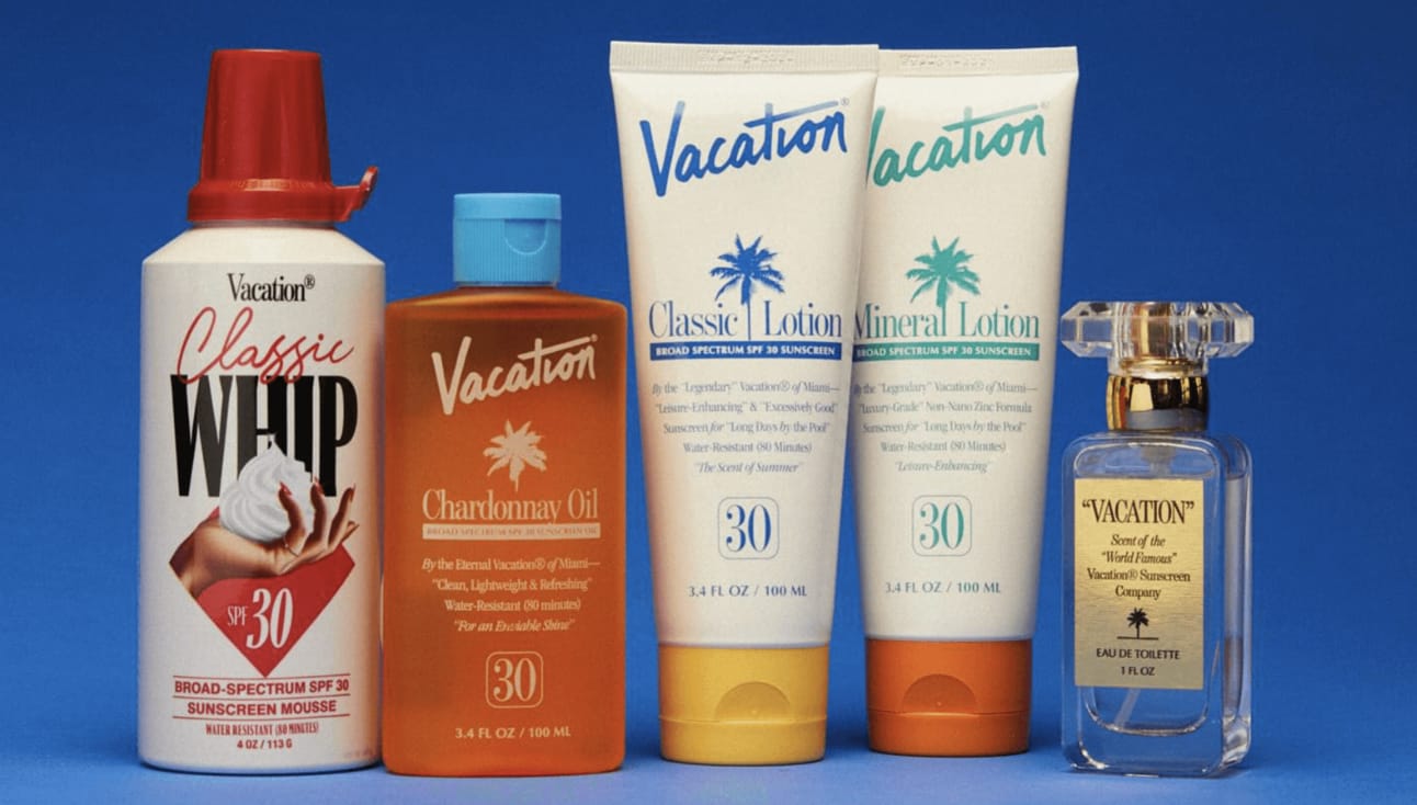
Vacation draws inspiration from carefree '80s and early '90s when sunscreen was linked with relaxation and tanning rather than fear and protection. The brand originated from retro internet radio station Poolside FM. Founders were inspired by vintage Club Med advertisements and era when sunscreen marketing was about enjoyment and glamour of tanning.
They launched exactly when nostalgia trend was beginning. Got massive audience resonance. Smart move. They play around one theme, digging inspiration from '80s packaging for new products. They're not blurring brand identity. They're strengthening it through shootings, campaigns, ads, typography, activations.
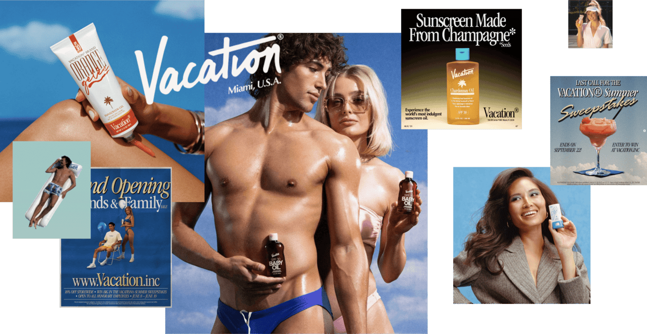
The main thing about Vacation's success: they sell one big story. Fun, easy life of pre-internet era. As they play around pop-culture phenomena, it's easier to get resonance from mass consumers.
Skeptics say trend will pass and users will switch to something new. But Vacation does so many interesting launches that it's worth coming back to their nostalgic universe. They're not riding a trend. They're building a world.
The brand doesn't sell sunscreen. It sells membership in aesthetic community that values '80s beach culture. The product is proof of belonging.
Ultra Violette: design product line architecture before first launch
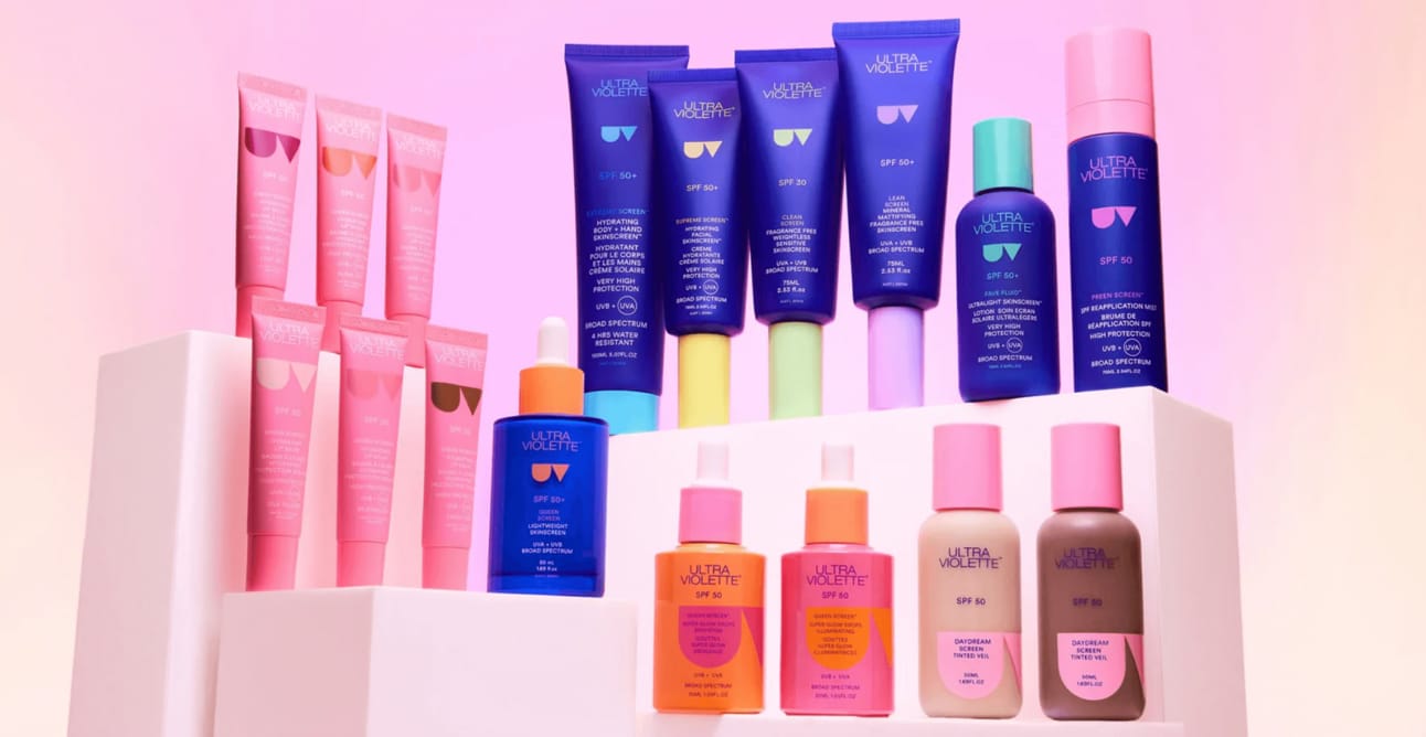
Ultra Violette is Australian sunscreen brand famous for innovative, multitasking SPF mineral products combining sun protection with skincare benefits. Australia takes sun protection seriously due to high skin cancer rates. That geographical context gives brand credibility.
The brand created bold graphic sign from first letters of naming. It works significantly on packaging to attract attention. Logo appears bigger with new products. Some text placed inside. Flexible and distinctive approach.
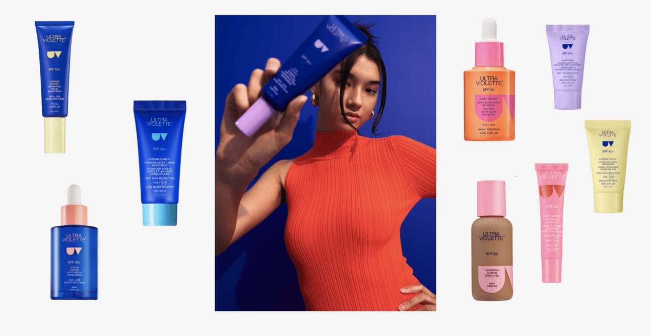
Main product line uses signature cobalt blue for memorability. Additional launches (lipstick line) launched in pinkish colors. But what creates real cohesion? The caps.
Look at cobalt blue packaging. Pale-colored caps for differentiation. Then same pale colors used in other products. Brilliant. This approach creates strong memorability and brand cohesiveness across categories.
The system works because it's designed as system, not individual product decisions. They thought about line architecture beforehand rather than adding products reactively.
Strategic Pattern: For beauty brands planning multi-product lines with $100k+ development budgets, design color architecture system before launching first product. Define primary brand color, secondary differentiation colors, and how they work across categories. Ultra Violette's cap system allows infinite product expansion while maintaining instant recognizability.
Supergoop: book a color combination, own it completely
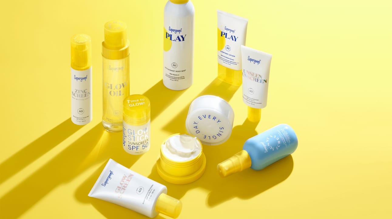
Supergoop is one of first sunscreen brands that boomed as dedicated sunscreen company. Holly Thaggard launched it in 2007 after close friend was diagnosed with melanoma at age 29. She's been dedicated to sun protection for over 15 years, leading to highly innovative solutions.
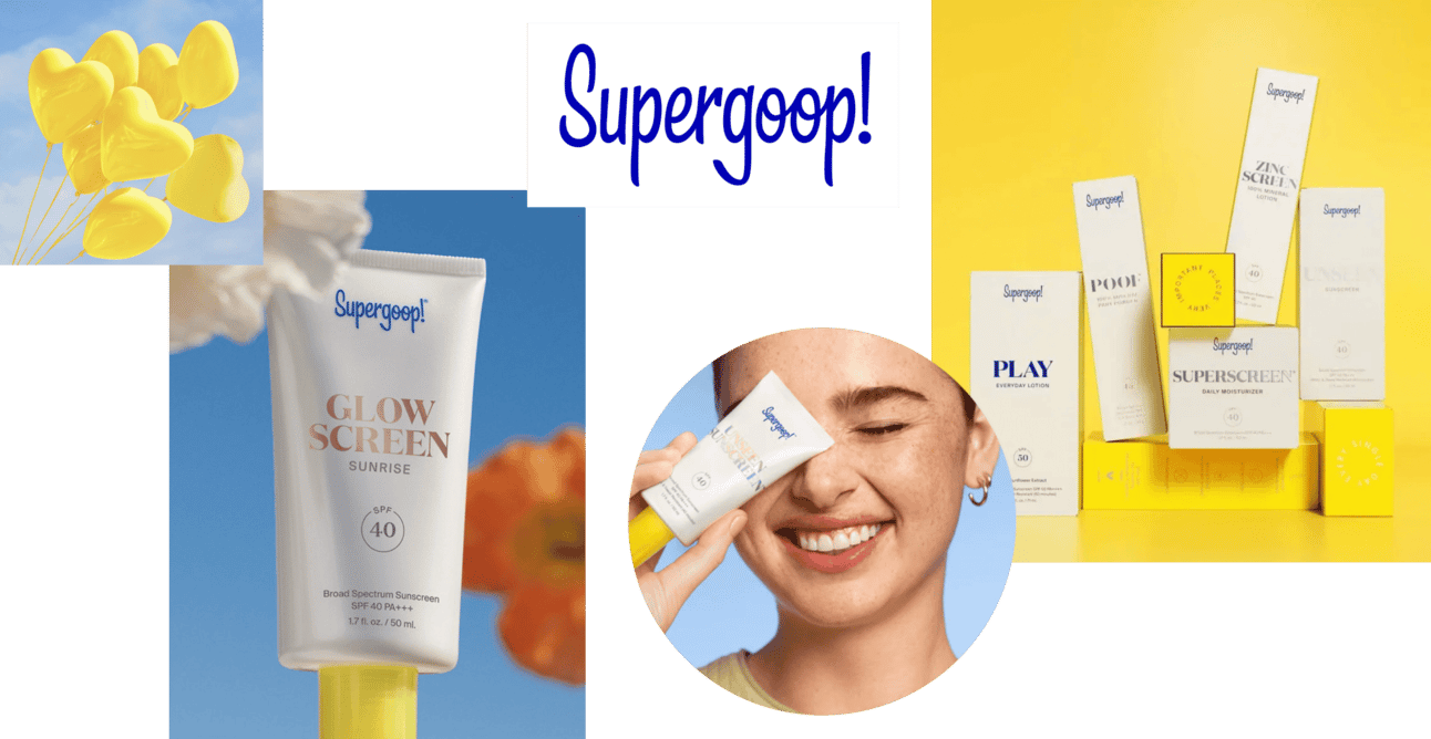
They do great job with brand identity. Balanced, clean, minimal, timeless. Combination of white and yellow with holographic typography does actual work—creates strong association with sun. They took direct association elements (sun = yellow) and mixed them. Simplicity is genius.

Supergoop booked yellow color. They created so many creative activations and campaigns. This all works because they're consistent with one sun-kissed yellow. One recent activation: handsome concierge with giant suitcase packed with Supergoop products, inspired by Wes Anderson style. The concierge is so attractive you keep him in mind and go to nearest Sephora.
Marketing at its best. The product becomes prop in aspirational narrative rather than the story itself.
Supergoop valued at $600-700M demonstrates sunscreen category potential when positioned as lifestyle brand rather than clinical protection. Brand consistency around single color (yellow) and holographic effects created instant recognizability that justified premium pricing.
Bask: understand your product strength, don't follow aesthetic trends
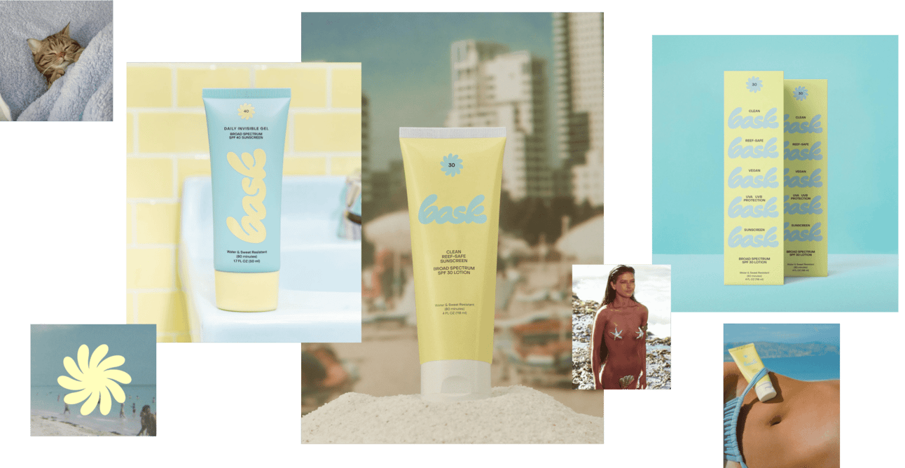
Michael Huffstetler founded Bask after family member's melanoma battle. Goal: make sun protection more enjoyable and accessible.
Bask surveyed over 50,000 people, interviewed 500 to understand issues with existing sunscreens. Main problem? How sunscreen feels on skin. After 63 product iterations, Bask developed sunscreen that 9 out of 10 people preferred in blind feel tests compared to leading brands.
Their aim: create sunscreen people actually enjoy using.
From branding perspective, it's fresh, modern, vibrant. Evokes '90s vacation sense. Unfortunately, comes across as secondary to Vacation brand. The research and product development approach behind it is profound. But the branding doesn't match the product innovation strength.
Recommendation: Don't build brand on nostalgia trends when your actual differentiation is formula feel. Position more seriously as everyday sun protection product people want to use. Suggested positioning: "Not just for vacation." Lead with functional superiority (feel test results), not aesthetic trend-following.
Dune suncare: create brand mood while incorporating social impact
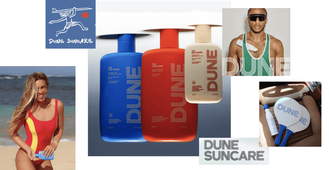
Dune Suncare aims to create accessible suncare brand with focus on skin tone inclusivity and clinically proven skincare benefits. They reference '90s inspiration and Olympic sports vibe through logo line. Navy blue, scarlet, beige colors create vibrant, cohesive surfing look.
Dune goes beyond product innovation and affordability by incorporating social impact into brand strategy. Brand donates 1% of every purchase to nonprofit organization chosen by customer. This commitment to giving back resonates with consumers who prioritize supporting socially responsible brands.
By aligning business with social cause, Dune creates positive impact and establishes deeper emotional connection with customers. The brand mood (active, outdoor, inclusive) matches the social positioning (accessible, community-focused). That's coherence.
Color psychology in sunscreen packaging:
It's all about color psychology, certain hues can evoke specific emotions and perceptions, making a big difference in consumer behavior. Let's take a closer look at how different colors play a role:
- Yellow and orange signal sun protection category. Yellow strongly associated with sunscreen. Drugstore brands use yellow to highlight sun protection message, tapping into natural connection between yellow and sunny outdoors. Orange (closely related to yellow) evokes warmth and protection against sun damage. Supergoop owns yellow in premium segment. Drugstore brands can't compete on that association because Supergoop got there first with premium positioning.
- Blue and violet create trust and calm. Studies show blue and purple enhance positive behavior intentions. Consumers more likely to use sunscreen when packaging features these calming, trustworthy colors. Blue suggests reliability and serenity, making it easier to trust product. Violet adds elegance and sophistication. Ultra Violette's cobalt blue isn't random. It's strategic trust-building through color psychology while differentiating from yellow-dominated category.
- White communicates purity and versatility. White conveys purity, transparency, straightforward appeal. Suggests gentleness on skin. White tube with yellow or orange accents implies product suitable for both beach use and everyday protection. Emphasizes versatility.
- Brown suggests tanning and bronzing. Brown used for tanning sunscreens, suggesting natural, bronzed look. Appeals to those desiring sun-kissed glow and healthy tan. This is counter-positioning against protection-focused brands.
- Red creates urgency and specificity. Red highlights specific features or creates distinct identity. Conveys benefits, urgency, uniqueness. Example: My Signature Vita Red Sunscreen.
By understanding these color associations, brands can strategically design their sunscreen packaging to build trust and attract more consumers. Next time you reach for sunscreen, notice how the packaging colors make you feel—there's a good chance they’ve been carefully chosen to do just that!
Audit your sunscreen line (or any clinical beauty category) against emotional positioning criteria:
- Are you selling fear (sun damage, aging, cancer risk) or aspiration (bronzed memories, carefree summer, beach lifestyle)?
- Does your color choice strategically differentiate or blend into category norms?
- Is your brand world consistent enough to create loyalty, or are you just another SPF extension?
Clinical categories expand when repositioned as lifestyle accessories. The brands winning this category understood that first.
June 11, 2024
.png)