When indie beauty brand finds itself blending in instead of standing out, it's time for makeover. Remilia Hair is company known for innovative single-use hair serum capsules, realized that while product was hit, brand identity had become just another face in "clean beauty" crowd.
They embarked on bold rebranding journey (together with Orchidea team) and came out other side with more than prettier logo. Result: +69% jump in average order value, +44% conversion rate. Three major retailers signed right after Cosmoprof event.
Yes, fonts and colors did that. Or rather, right fonts and colors, in hands of professionals. Along the way, we picked up few hard truths about rebranding, kind that make founders sweat, investors nod, designers argue.
Know when your brand identity no longer matches your business ambition
Remilia had product consumers adored, but branding was too comfortably lodged in indie clean-beauty niche. Brand's style was so safe and familiar it risked blending into crowded market.
If your branding could be swapped with three competitors and no one would notice, you don’t have an identity. Pretty fonts and nice packaging won’t cut through if they don’t say something only you could say. Design without a point of view is just noise.
Problem: consumers love product, but can't remember brand
People talk about how amazing your product is, then forget your name. That's classic mismatch. Recognition matters. If logo isn't clear, packaging isn't distinct, or story isn't sticky, you're bleeding equity.
If they can't recall you, they can't re-buy you. This is expensive problem. Customer acquisition costs stay high because you're constantly replacing customers who loved product but forgot brand name when repurchasing. Recognition creates retention.
Strategic pattern: when consumers praise product but can't recall brand (talking about "those little cork caps" without saying Remilia), you have product-market fit without brand-market fit. This creates acquisition cost problem, every purchase requires re-education because brand doesn't stick in memory. Rebranding solves recognition gap by creating distinctive visual identity and emotional positioning customers remember between purchases.
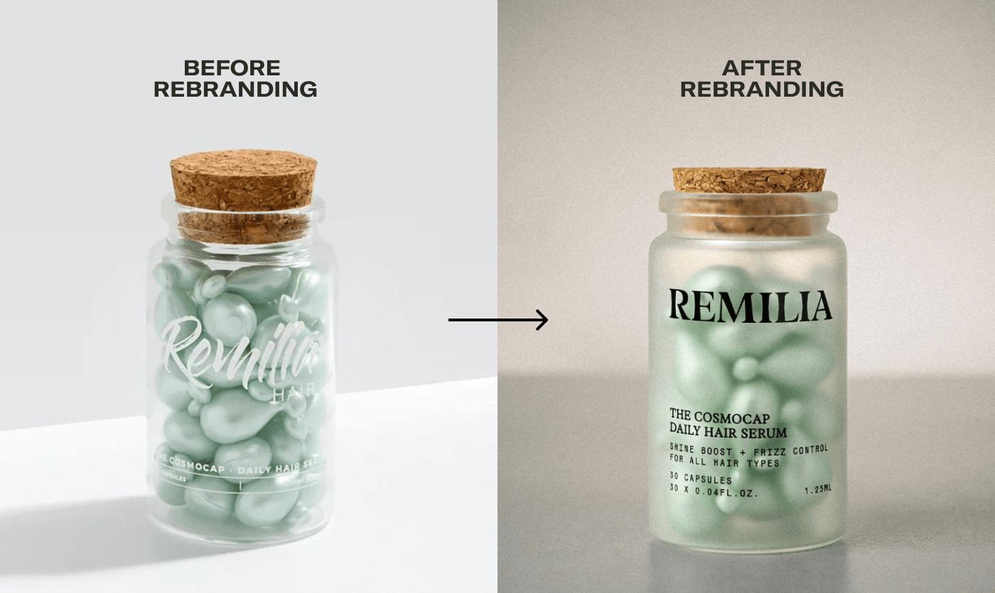
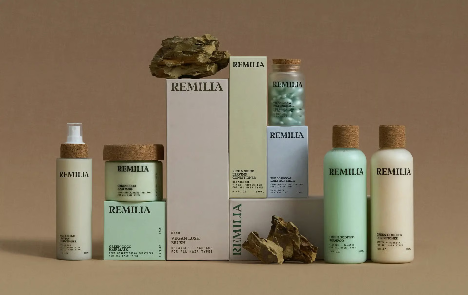
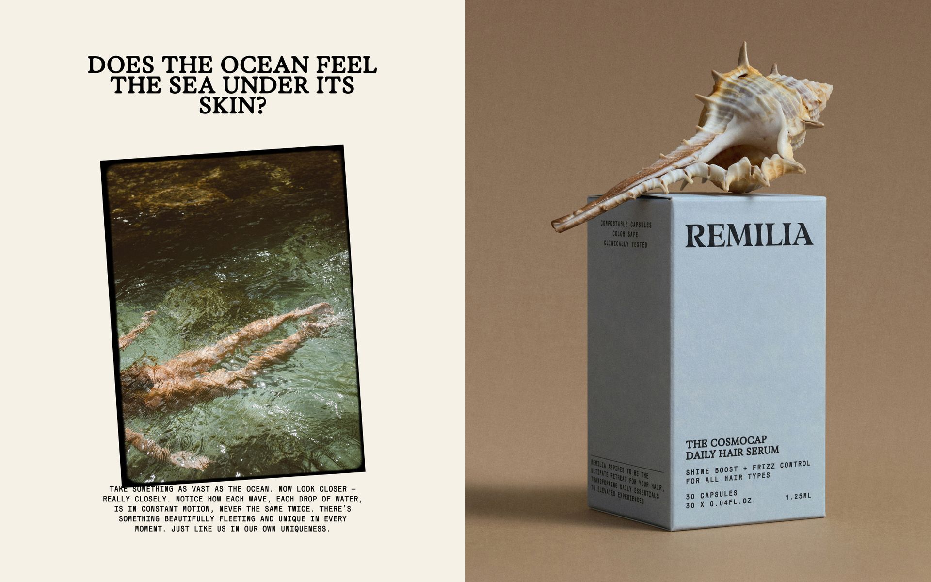
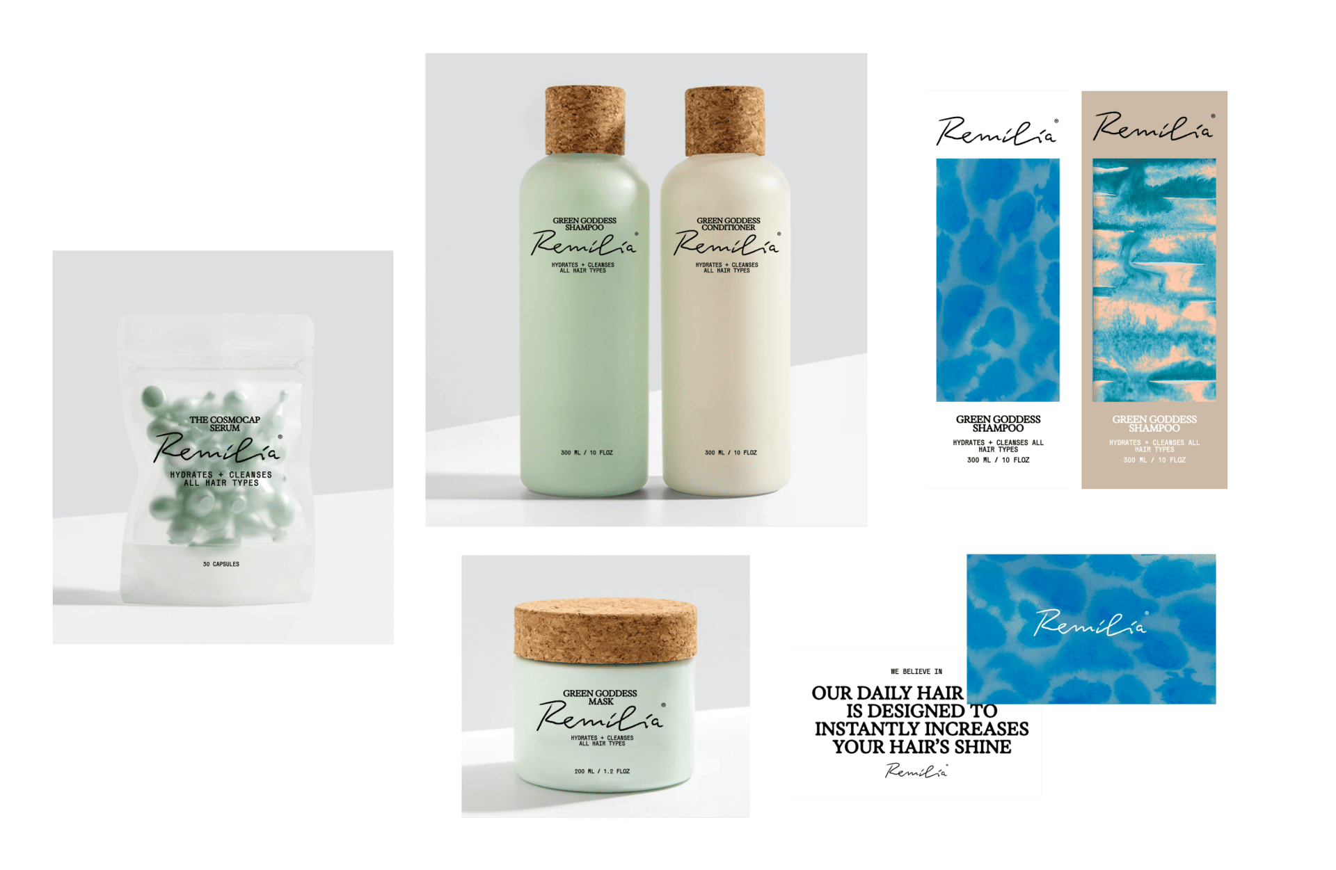
When we took on Remilia's rebrand, one element was sacred: those little cork-cap—brand's signature packaging. We weren't about to mess with that piece of packaging (non-negotiable). Everything else, however, was fair game for upgrade.
Refresh positioning: from occasional use to daily ritual
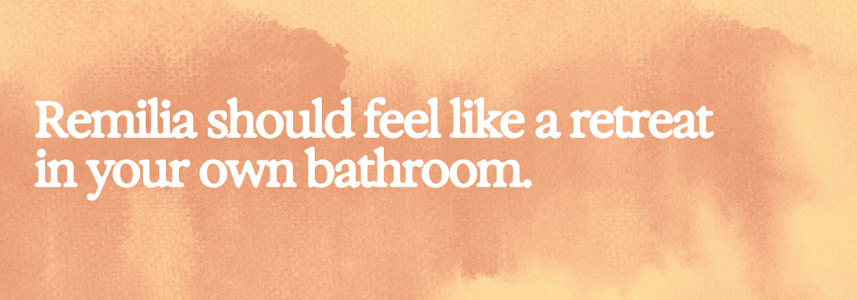
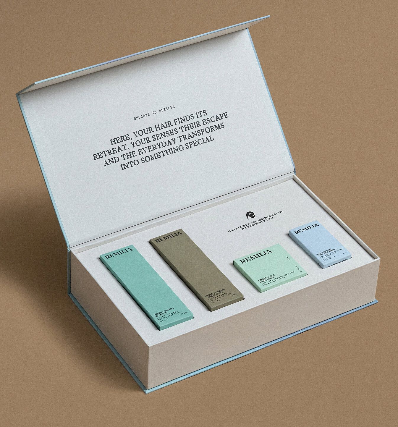
Together with client and brand strategist, we shifted Remilia from travel-oriented positioning to emotionally driven brand platform: feeling of retreat in your own bathroom. Turns professional hair care into at-home ritual people can feel every day. This platform is strong, expandable universe supporting future narratives, product launches, communications.
Build brand that drives repeat purchases, not one-off buys. Travel positioning creates occasional-use mindset (pack these for trip). Retreat positioning creates daily-ritual mindset (this is part of self-care routine). Frequency shift directly impacts revenue.
The emotion we want to evoke: retreat feeling, sanctuary moment, professional care at home. Not "convenient travel size" or "clean ingredients." Emotional platform creates stickier positioning than functional benefits.
In any rebrand, figure out what makes your brand uniquely you (keep it), then give stylish makeover to rest. Don't throw cork out with bottle. Preserve good stuff and boldly reinvent things that aren't working.
Orchidea strategic advice: For beauty brands considering rebrand with $50k-100k budgets, audit current brand architecture worth preserving before changing everything. Remilia's cork-capped capsules had recognition value, changing them would erase existing equity. Identify your equivalent: distinctive packaging element, signature ingredient, recognizable color, unique delivery format. Preserve that anchor while evolving positioning, typography, messaging around it. This maintains continuity for existing customers while attracting new ones through refreshed identity. Complete teardown erases equity. Strategic preservation + evolution builds on what works.
Throughout the process, expect iterations and embrace the discomfort of change
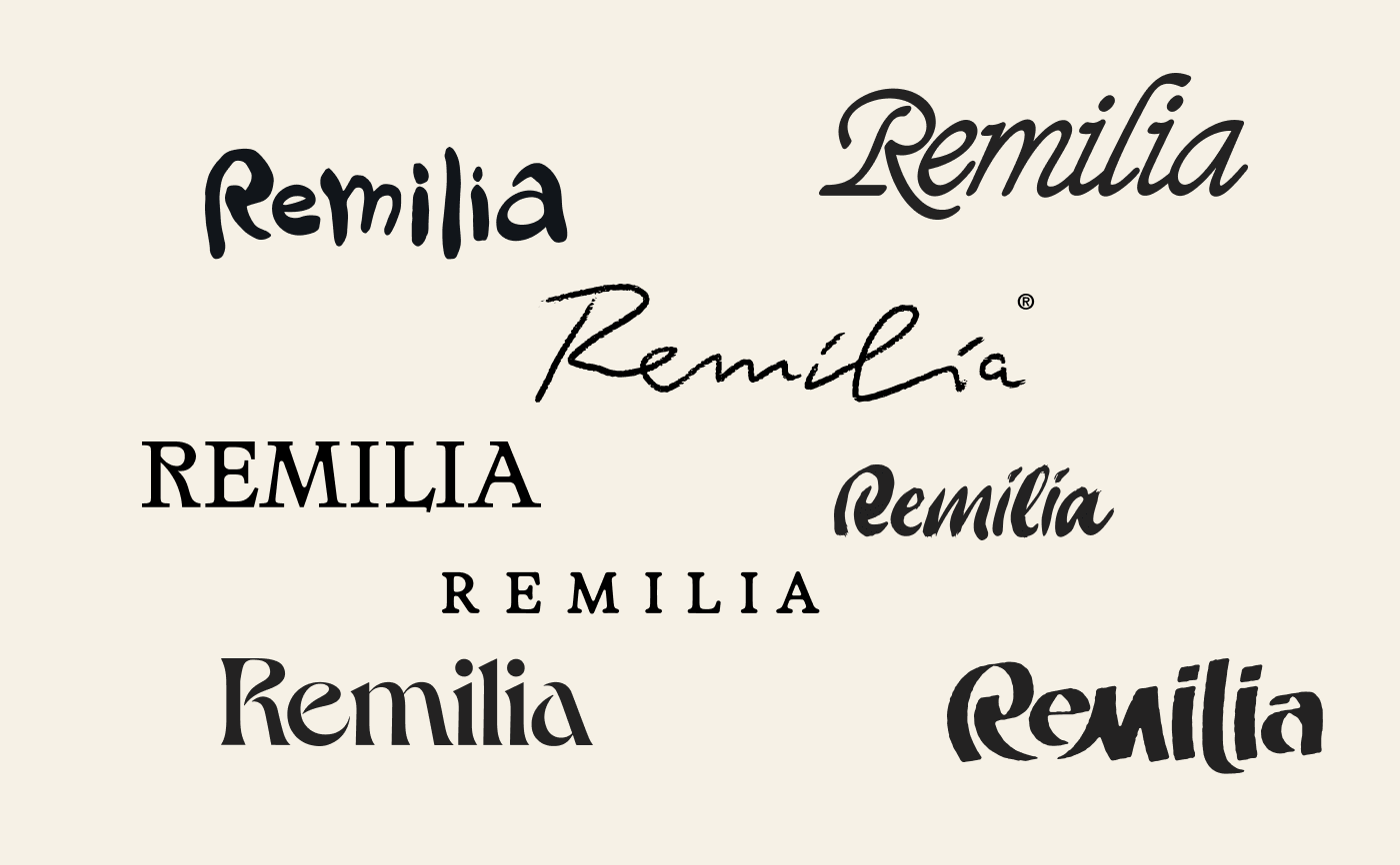
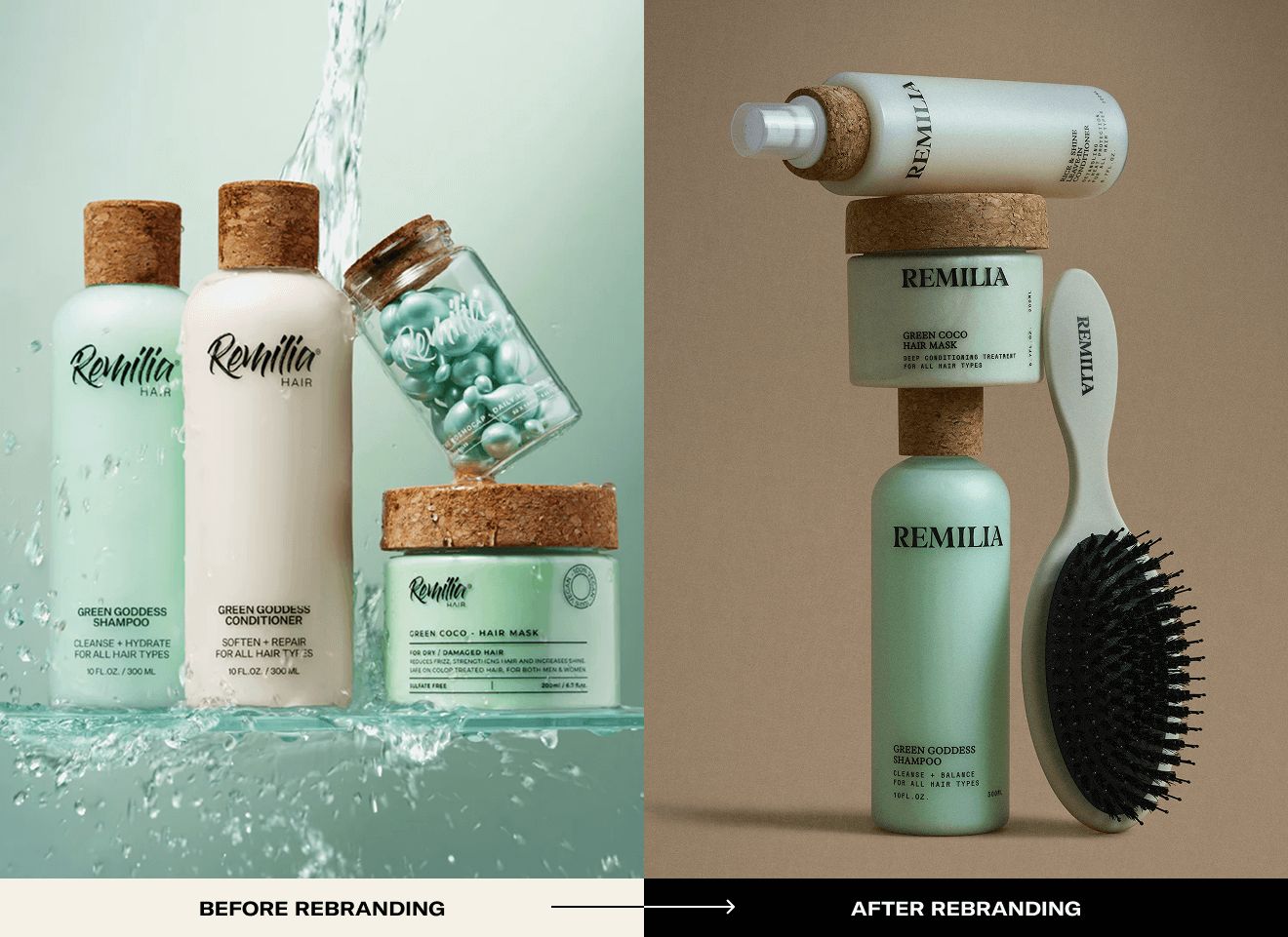
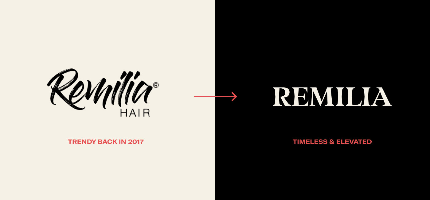
Here’s a not-so-secret secret: rebranding is scary for founders. At the start, everyone tends to cling to the “safe” option (the familiar logo, the comfy color palette) like a security blanket. Remilia’s founder was no exception, and our design team went through about seven logotype versions before landing on one that felt both true to the brand and daring enough to stand out.
After extensive rounds of tweaking, we made a decisive shift from the original script-style logo to a clean, typographic logotype that had the modern, global-ready vibe Remilia needed.
Always test logotype on real packaging
We explored elegant new lettering during process, but on-pack tests proved it wasn't solution: looked refined on screen, disappeared on shelf. That's not rebrand, that's compromise.
Always test logotype on packaging to make sure it truly fits. Screen testing shows beauty. Shelf testing shows functionality. Need both. Beautiful logo disappearing at retail distance fails business objective even if designers love it.
Every founder might want to play it safe at first (totally normal), but real breakthroughs often require embracing option that initially feels little too bold. The logo feeling "too modern" or "too different" might be exactly right choice for breaking out of competitive sameness.
Great rebrand isn't only about looking pretty, it's about making people feel something while still remembering your name.
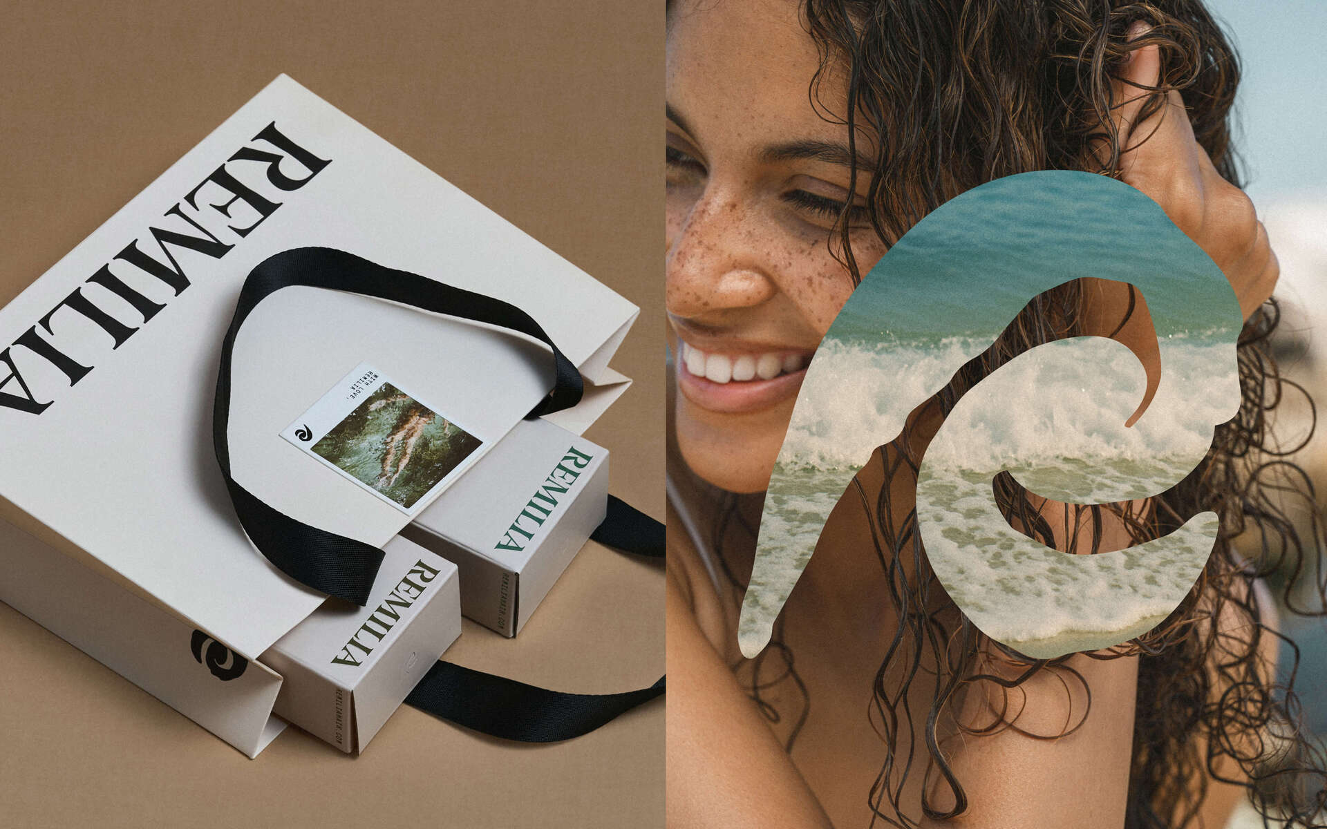
For Remilia, we achieved this by creating logotype that's actually readable yet distinctive, pairing it with small dose of art. New abstract "R" symbol we crafted does triple duty: looks like gentle wave, strand of hair, symbol of renewal, all in one graceful stroke.
Result is brand mark with both emotional appeal and instant recognizability. Speaks to product's essence of softness and self-care while ensuring you don't confuse Remilia with anyone else on shelf.
The abstract R isn't arbitrary decoration. It's mnemonic device. Wave = water/cleansing. Hair strand = category. Renewal = transformation promise. Symbol doing multiple jobs simultaneously creates richer meaning customers intuitively understand without needing explanation.
Hidden patterns that evoke memories of retreat
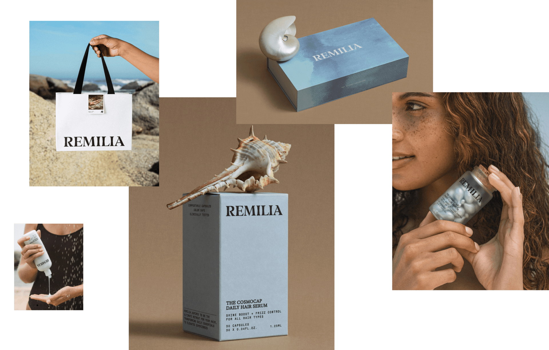
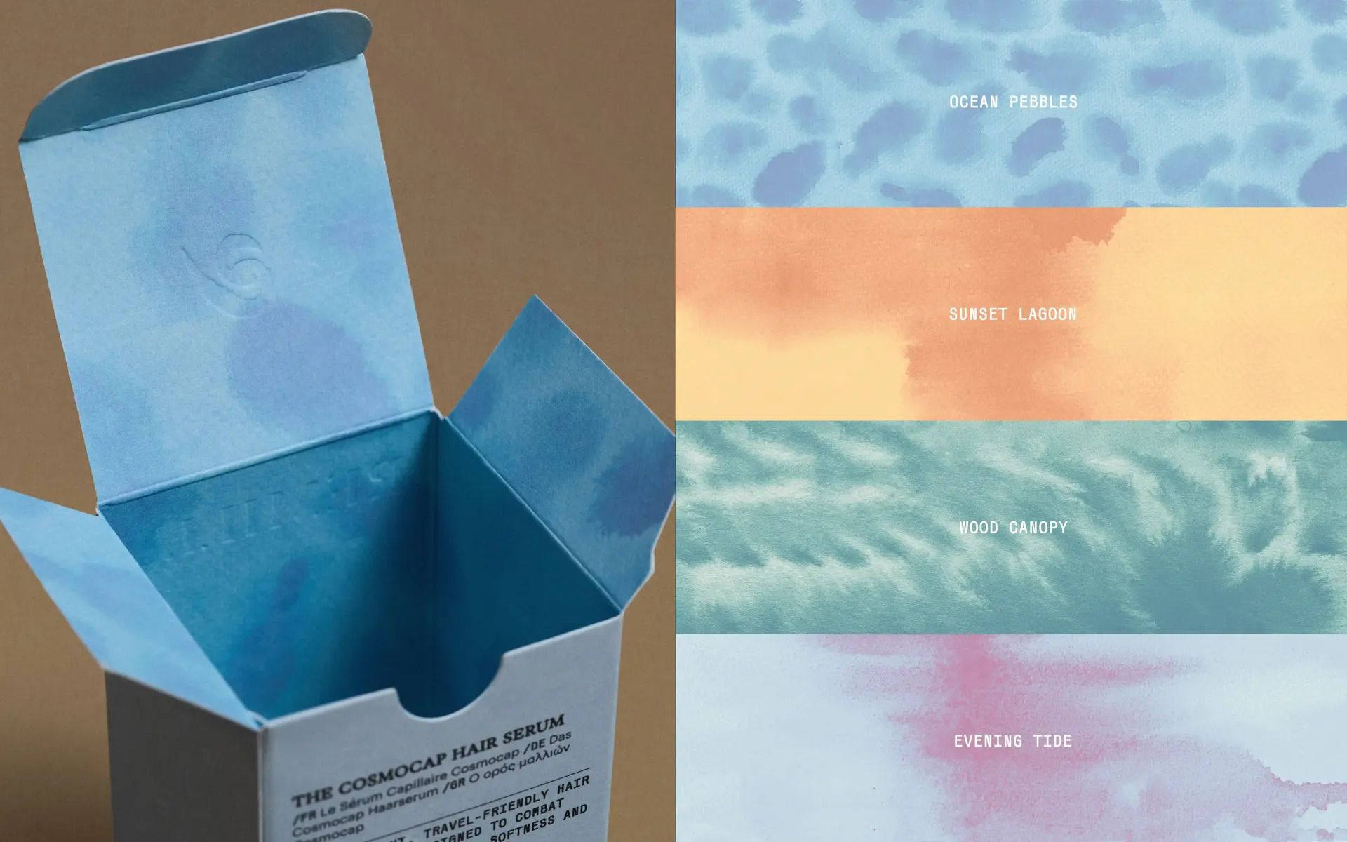
We created additional visual language for internal part of packaging to create wow effect while opening product—watercolor illustrations with Ocean Pebbles, Sunset Lagoon, Wood Canopy, Evening Tide. You don't need words to explain mood. You just feel it.
Visual idea adds variety, making each new product feel distinct while staying within brand line. Each pack features unexpected visual pattern inside. This creates unboxing moment generating user-generated content and reinforcing retreat positioning through sensory experience.
Opening package becomes moment of discovery (what pattern is inside?), reinforcing retreat feeling through visual surprise. This transforms functional product consumption into ritual worth photographing and sharing.
Measure success in business, not just aesthetics
At end of day, rebrand isn't just vanity project—it's business strategy. So how did Remilia's makeover fare in real world? In short, it paid off.
Post-rebrand, Remilia's average order value jumped 69%, conversion rate climbed 44%. Even better, new elevated look helped land Remilia deals with three major retailers (they came knocking as soon as they saw chic new branding).
Those numbers speak louder than any trendy font or color ever could. Point here is success is measured by business growth your new brand identity drives more sales, more customers, more partners, not just how nice your Instagram feed looks after redesign.
The +69% AOV increase comes from multiple factors working together:
- Retreat positioning justifies premium pricing (daily ritual vs occasional travel product)
- Readable logo and distinctive R symbol increase brand recall, reducing customer education cost
- Interior patterns create shareable moments generating organic social content
- Elevated aesthetic signals quality justifying higher price points
- Retailers willing to stock premium-positioned brand over generic clean beauty
The +44% conversion improvement likely stems from clearer brand identity reducing purchase hesitation. When branding is generic, customers comparison-shop. When branding is distinctive with clear emotional promise, decision becomes easier.
Three retail deals post-Cosmoprof validate that brand identity directly impacts B2B partnerships. Retailers saw elevated packaging and distinctive positioning, recognized shelf differentiation potential, signed deals. Generic clean beauty aesthetic wouldn't have generated same interest.
In short—don’t lose momentum, change when it’s time
Rebranding is not for the faint of heart. It’s a roller coaster of introspection, iteration, and the occasional identity crisis. But as Remilia Hair’s story shows, when done right, a bold rebrand can rejuvenate your business and propel it to new heights.
So, the next time you suspect your brand is stuck in a crowded market, take a deep breath and remember these lessons. Embrace a little fear, hold on to what makes you unique, and dare to change the rest. Your brand (and your bottom line) will thank you for it.
November 12, 2025
.png)