How to built a brand? The entrepreneurship recipe looks simple: buy private label formula, hire freelancer for logo, choose standard packaging, set up Shopify template. Voilà, you launch a brand.
But if your goal is setting brand apart and building loyal following beyond transactional customers, you need more than pretty logo. You need brand that doesn't just sell products but inspires fans who stay long-term. We'll guide you through brand creation process using our project Rest Religion as example. Two-step skincare brand that made waves in US market from day one. Featured in ELLE Magazine as part of best anti-aging serum roundup.
Let's assume you have product already. Market demand exists for category. Your product has clear competitive advantages. What next?
In-depth research that uncovers unexplored insights
First step in creating successful brand: think about differentiation strategy.
This involves diving deep into market research uncovering insights that truly resonate with target audience. Understanding your audience isn't just knowing demographics. It's understanding what's on their minds and hearts. What keeps them up at night? What are their pains, desires, aspirations?
When crafting brand strategy for Rest Religion, we conducted 15 in-depth one-on-one interviews. Ran surveys on social media gathering insights directly from target customers. Analyzed data, explored major social reports (Statista, Mintel, The Future Laboratory) understanding broader market trends.
After two months of research, we discovered powerful revelation from emerging field of psychodermatology: stress and lack of sleep might be ultimate enemies of skin health.
All-too-common struggles in fast-paced lives leading to inflammation, skin damage, disrupted repair mechanisms. How would chronically underslept and overworked Americans feel about this fact?
This insight became backbone of Rest Religion. Brand with power to counteract effects of internal and external stressors on skin AND inspire customers to reclaim their right to rest.
Strategic pattern: Most beauty brands rely on surface-level insights (confidence, self-care, empowerment) already saturated in category messaging. For Rest Religion, we found unexplored territory at intersection of psychodermatology research and cultural reality (chronic sleep deprivation, overwork culture). Insight depth determines differentiation potential. Generic insights create generic brands.
Powerful core idea that scales across all touchpoints
When you uncover relevant customer insight, next step: ensure you're uniquely positioned to address it. Whatever claim you make, you must deliver on it and have persuasive arguments making audience believe you.
Once you've laid rational foundation, let imagination craft bold creative expression for your brand: core idea, brand character, attributes, modes of expression. How do you know creative idea is solid? It effortlessly scales across all brand elements (naming, visuals, messaging) and most importantly, it's deeply connected to your product and future launches.
Rest Religion core idea: "The stress is real, and we're here to see you through it."
In world where rest is privilege, Rest Religion steps in to support you in moments when you can't hit pause when you need it. Brand reminds you rest is essential to well-being while acknowledging challenge of getting enough of it. Products work like chicken soup for skin: soothing effects of stress, restoring balance, building resilience for future. This isn't just marketing campaign. It's essence of brand, influencing everything from product development to customer experience.
Orchidea strategic advice: For skincare brands with $75K+ brand development budgets, invest 40% of timeline in research and core idea development before touching visual design. Rest Religion spent two months on research phase, uncovering psychodermatology insight that competitors missed. This foundation enabled coherent brand architecture across naming, packaging, messaging, product development. Skipping straight to logo design without strategic foundation creates surface-level brand unable to justify premium positioning or build community loyalty.
Bold brand name that provokes and resonates
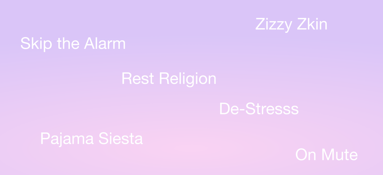
When you have brand idea and character blueprint, think how every single element becomes expression of who your brand is. Naming is one of most important means to make very first statement about your brand.
When "Rest Religion" first came up, we knew we had something special. Bold, memorable, bit edgy is exactly what we needed to stand out in crowded skincare space. More than brand name. It's call to action, capable of activating community of people who sense it's time to reconsider our relationship with rest.
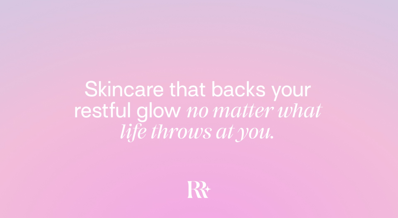
"Skincare brand that backs your restful glow" became our tagline, turning the concept of "restful glow" into a key brand attribute ripe for creative interpretation. For instance, when customers open the product packaging, they're greeted with "Enter your restful glow era," reinforcing the brand's idea at every touchpoint.
Ideal brand name doesn't just inform, it sparks feeling. When name's rhythm rolls off tongue and evokes vivid imagery, you've crafted more than name. You've created lasting impression.
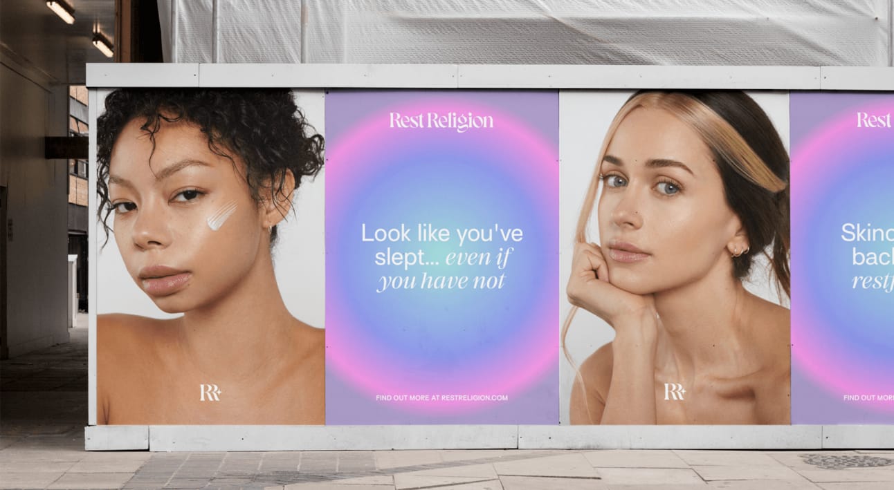
The name does cultural work. "Rest Religion" positions rest as sacred practice (religion) in culture that treats rest as laziness. That's provocative positioning creating immediate tribal identity: people who believe rest deserves reverence versus people who glorify hustle culture.
Hard data: Rest Religion featured in ELLE Magazine's best anti-aging serum roundup within months of launch. Strong day-one sales validated brand positioning. Investors praised work for delivering compelling story rooted in genuine consumer needs—something many brands fail to achieve. Brand's striking visual identity immediately resonated with customers, leading to conversion from first touchpoint.
Packaging design built around visual metaphor
Design is the visual extension of a brand’s core idea, the two must be inseparable. When a brand’s identity doesn’t align with its core message, it creates confusion, weakens the impact, and makes the brand less noticeable.
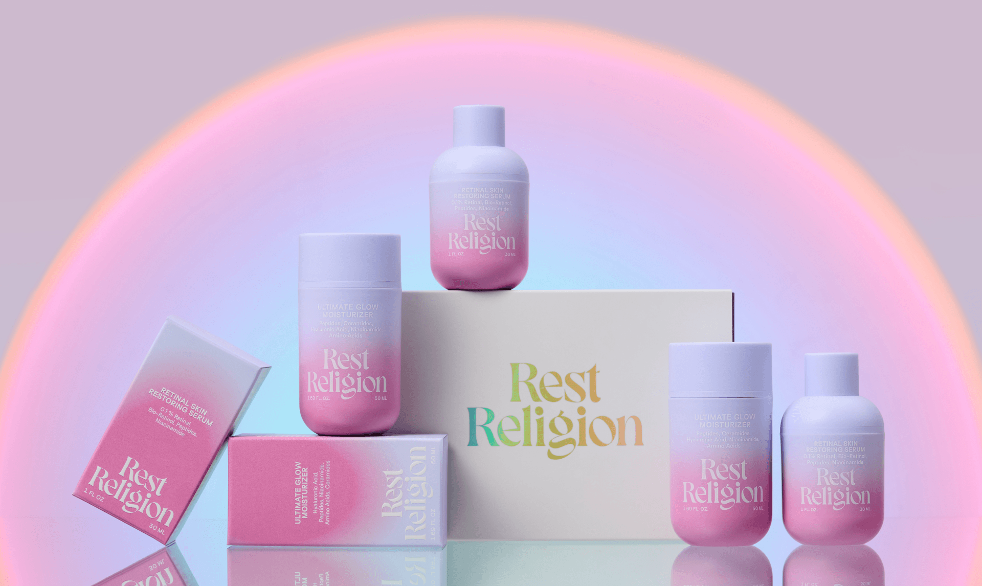
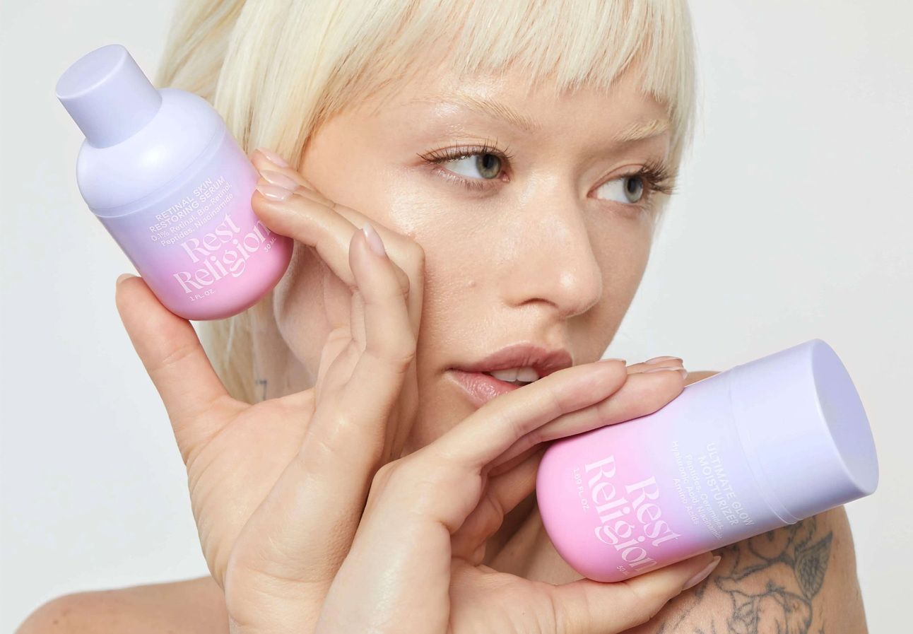
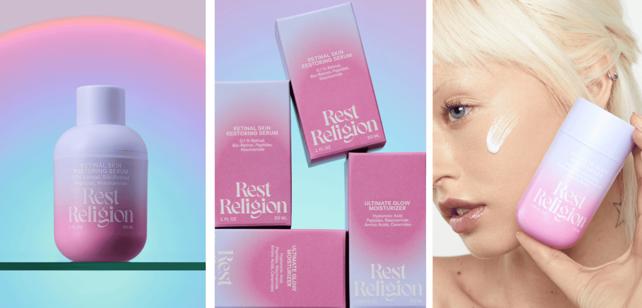
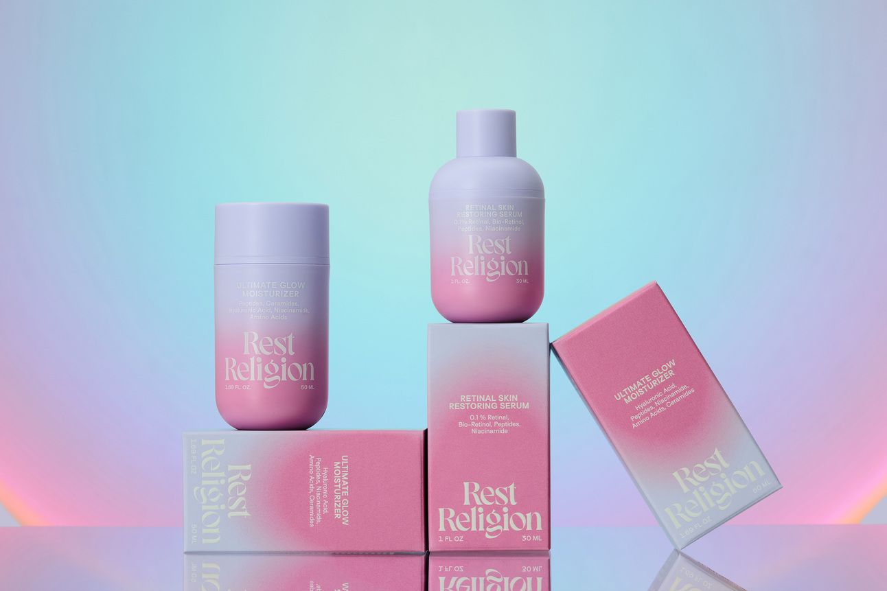
At Rest Religion, we built everything around the “Holy Halo” metaphor—a gradient that radiates from the product to your skin. The color palette is soothing and calming, with muted tones of purple and pink, creating a serene yet striking look that sets it apart from typical minimalist packaging.

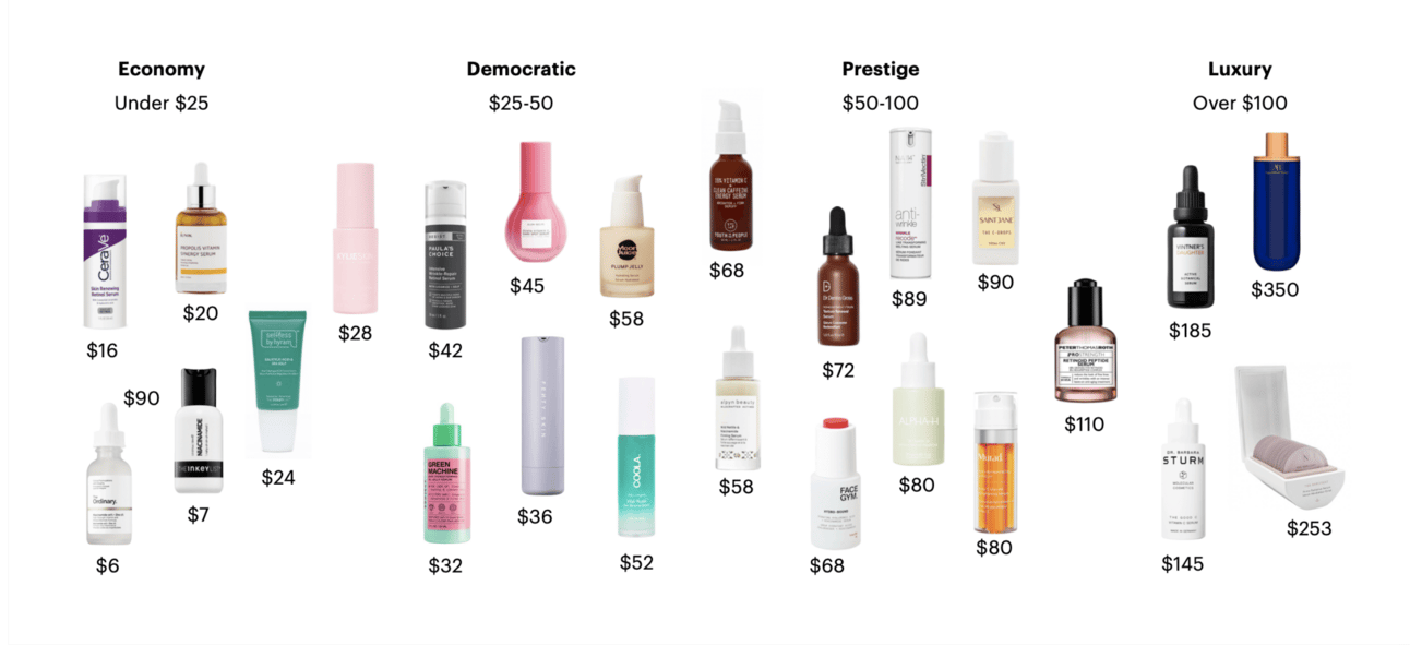
Always remember that the perceived value of the product should match or even slightly exceed its price tag, creating the feeling of getting more for less. That’s why the logotype is elegant, with smooth curves that evoke a sense of luxury.
We avoided black typography, as it would have disrupted the serene and restful atmosphere we aimed to create. The white text contrasts subtly against the background, ensuring readability while preserving the soft, minimalist vibe.
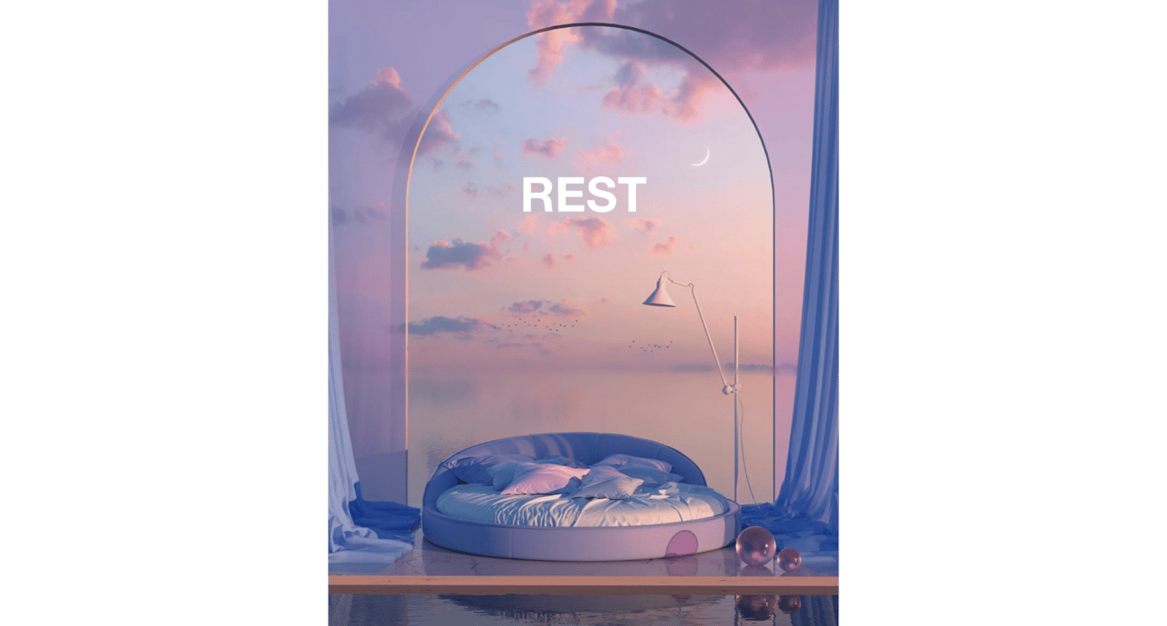
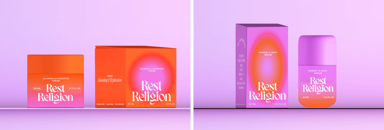
We experimented endlessly with palettes and gradients to capture the perfect restful vibe for the brand. Below is one of the first packaging designs we presented to the client in the renders. It's a great example of how a single idea can be transformed entirely just by playing with different color palettes.
During the brand identity phase, keep your competitors in mind to ensure you truly stand out and avoid unintentionally copying their colors or design approach. Find inspiration from other industries, as this can offer fresh perspectives and help create a unique identity that sets your brand apart in a crowded market. The goal is to be memorable, not to blend in.
Common mistake: Treating packaging as container for product rather than three-dimensional manifestation of core brand idea. Rest Religion's "Holy Halo" gradient isn't decoration—it's visual representation of "stress is real, we're here to see you through it" concept. The gradient radiates from product (halo/divine intervention) to customer's skin (transformation). Every design decision reinforces core idea. Brands that separate packaging design from strategy create visual noise without meaning.
Website built for beauty and conversion
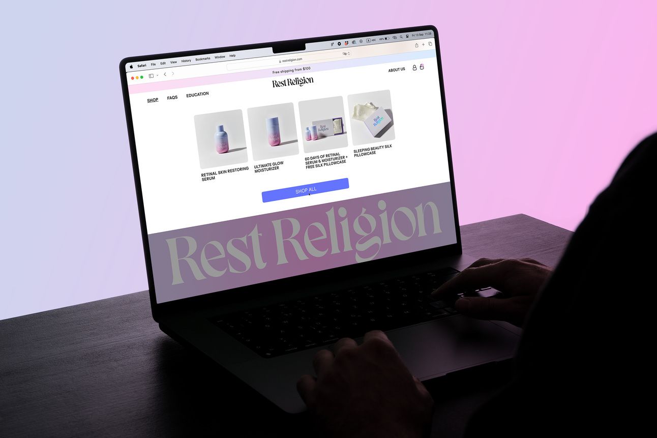
Shopify templates are convenient. But they often leave websites looking like clones of each other. That's exactly what we wanted to avoid with Rest Religion's site.
With just two products at launch, we knew homepage couldn't look like typical e-commerce site crammed with endless offerings. Instead, we had to make those two products shine and communicate brand essence from very first glance.
Anastasiya Van Elswyk, Founder of Rest Religion: "The team delved deeply into consumer's mindset, paving way for quality change in branding. This, in turn, created opportunity to reach broader audience, become recognizable, and achieve higher conversion rates."
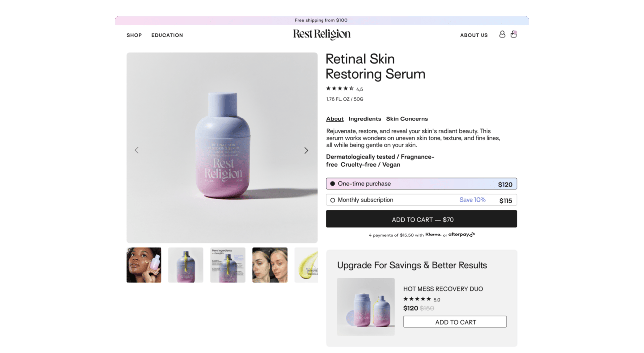
When working on website, first thing to consider isn't just how it looks, but what features you want to implement now and what can be added down road. Think about marketing tools like Subscriptions, Savings Offers, Before & After galleries. Building with these features in mind shapes brand experience from start.
Working closely with founder Ana and her partner James, we created high-conversion website blending marketing ingenuity with beautiful, mobile-friendly design. We brainstormed innovative e-commerce strategies, seamlessly integrated them into site layout while designing to convey essence of brand.
Maximize impact with smart content planning
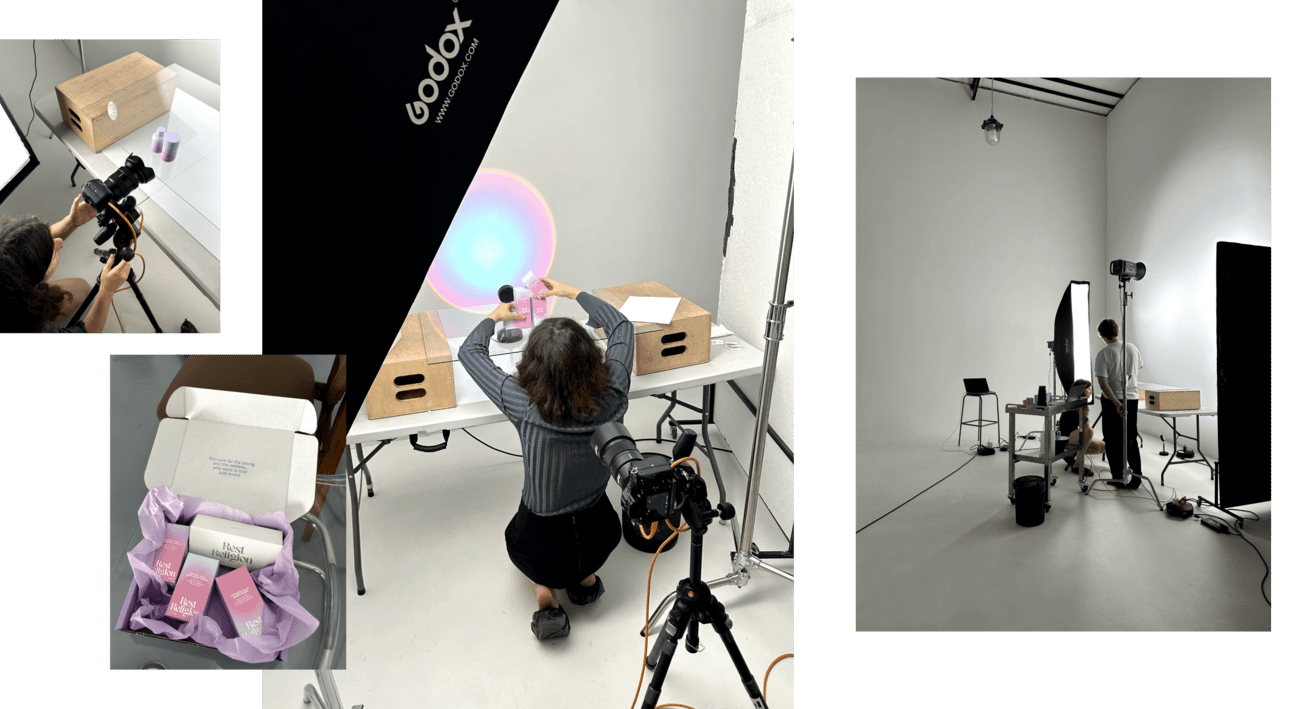
Never underestimate power of content. Before booking photographers or planning shoots, create detailed guide for every image you'll need.
Do you want lifestyle or still-life shots? Which images go where on site? What orientation works best?
Test different compositions of your product at home to discover best angles, textures, lighting preferences. This way, you'll know exactly how to highlight strengths and minimize weaknesses before photoshoot, ensuring best possible shots on set.
Careful planning not only saves time and money but also makes process predictable. Later, when you get shots, there won't be surprises.
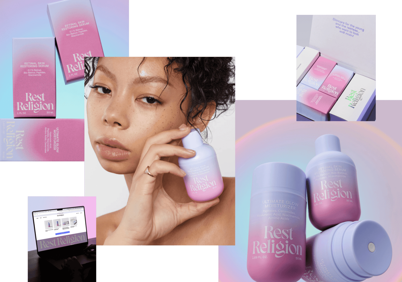
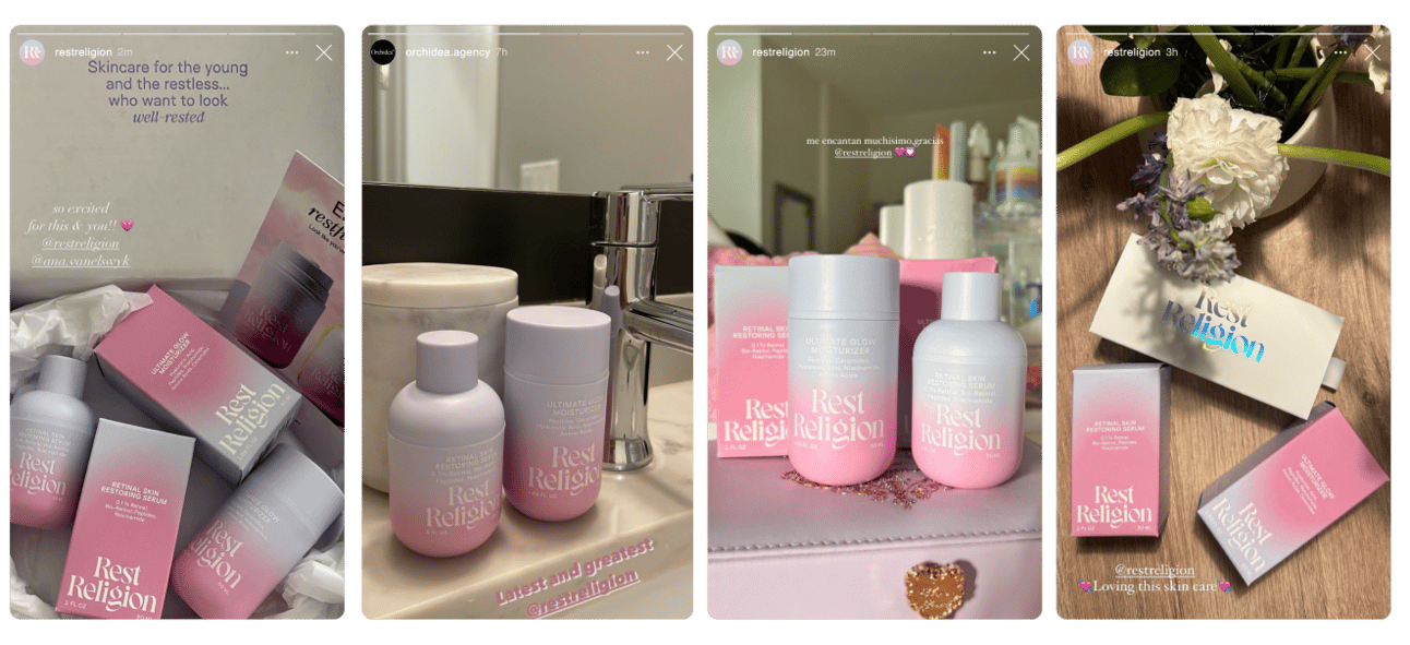
Our involvement didn't stop at launch. We continue working alongside founders, providing comprehensive support on social media, Amazon materials, email templates. Together, we've polished every aspect of brand, from product photoshoots to refining strategic messaging.

Success came from strategic foundation strength—two months research, co-creation with founders ensuring idea resonance, visual metaphor inseparable from core concept. Brands attempting surface-level creation (freelance logo, standard packaging, Shopify template) compete on commodity terms. Brands investing in differentiation strategy, unexplored insights, coherent brand architecture justify premium positioning and build community loyalty.
How to use this intelligence:
Audit your brand development process against Rest Religion methodology.
- Are you investing your time in research phase uncovering unexplored insights, or jumping straight to visual design with generic positioning?
- Does your core idea permeate product development, packaging messaging, customer experience, or does it only live in marketing copy?
- Is your visual identity expressing brand promise through metaphor (Holy Halo gradient = divine intervention radiating transformation), or just looking aesthetically pleasing without deeper meaning?
- Does your brand name create tribal identity through cultural positioning (rest as sacred practice vs hustle culture), or just identify product category?
Private label formulas with freelance logos create commodity brands. Strategic foundation with coherent brand architecture creates differentiation worth premium pricing and community activation.
October 10, 2024
.png)