Logos Talk. Symbols Signal.
Wearing a logo has always been a form of communication. A shortcut. A way to tell the world what you value, what you follow, and where you belong. On the other hand, logos carry a certain weight, sometimes too loud, sometimes too obvious, sometimes drifting into the territory of trying too hard. This is where symbols quietly take over.
A symbol does the same job as a logo. It signals identity, taste, even status, but it does it differently. More subtly. More elegantly. It becomes a code: instantly recognisable for those who know, and just a random decoration for those who don’t. The sweet spot between being loud and being anonymous.
A strong symbol creates a different kind of relationship between the brand and the wearer. It’s less about broadcasting. More about belonging. And from a business perspective, it matters more than it sounds. Products built around a recognisable symbol integrate more easily into everyday styling. They translate better across categories and formats. A strong symbol makes merch more wearable, more scalable, and more desirable to produce. When it's executed well, it stops being branding altogether and becomes a cultural code. That directly drives how a brand sells.
Loewe: the anatomy of a perfect sign

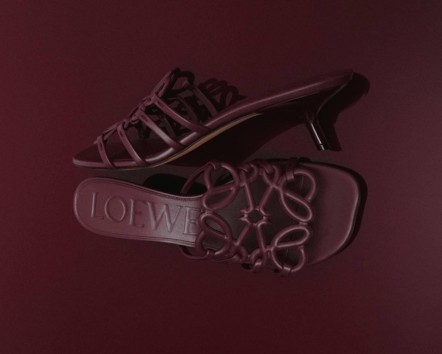
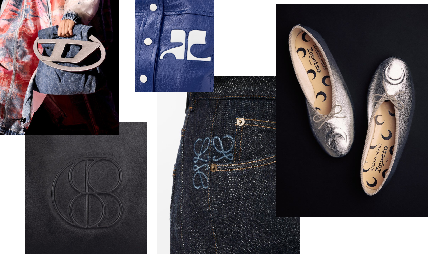
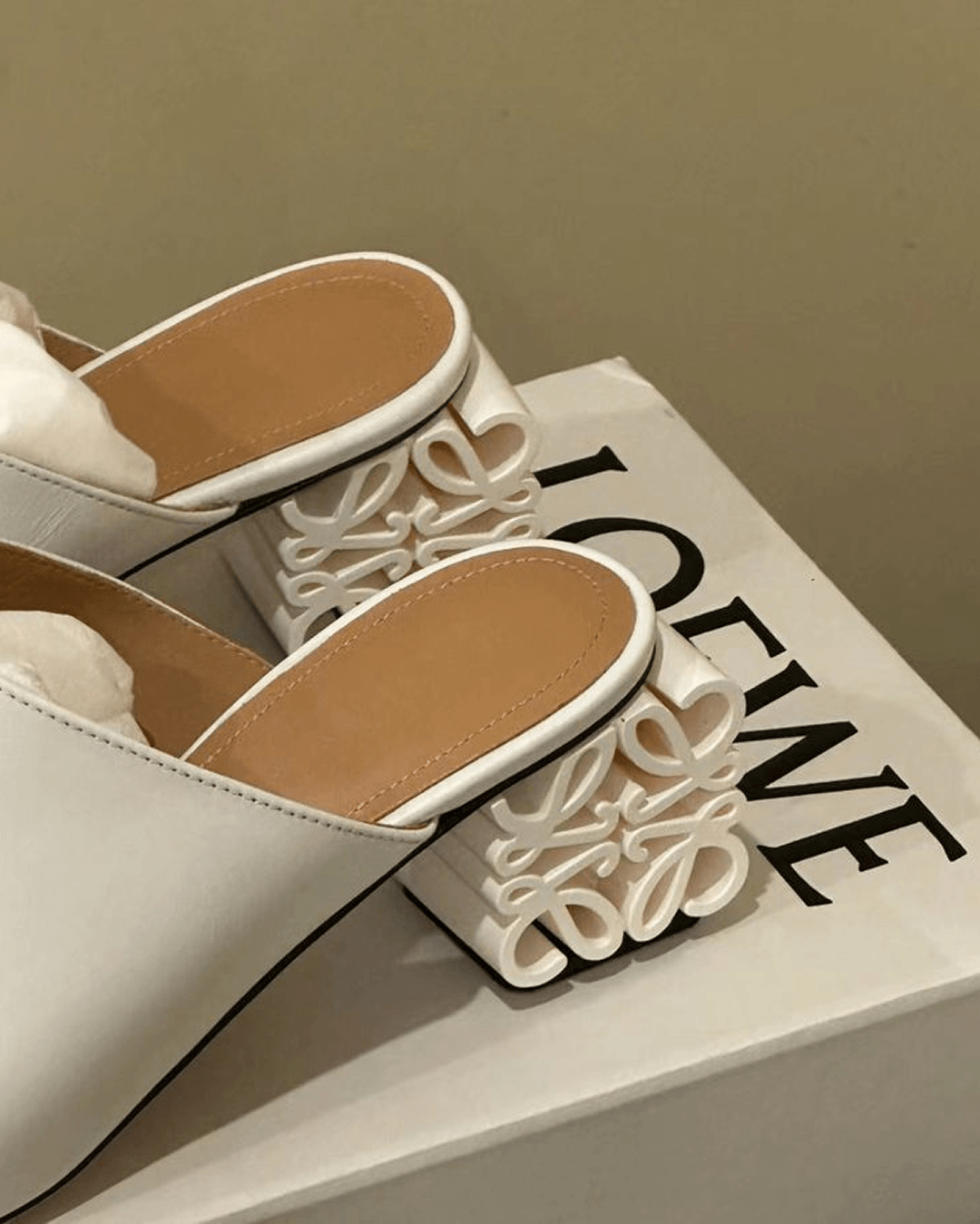
Few symbols are referenced as often as Loewe’s Anagram. It has become almost a default answer when clients describe what they want, even if they don’t fully understand why. The reason is structural. On paper, it’s extremely simple, a continuous line, no contrast, no visual noise. Yet the form itself is refined, almost ornamental.
This balance does most of the work. Simplicity of line ensures scalability, from tiny embossing to large prints. It survives embroidery, leather patching, hardware, and enlargement without collapsing. You can rotate it, inflate it, stretch it, repeat it, even deconstruct it to the single “L”, and it still feels like Loewe. That level of flexibility is what turns a sign into a system.
Hard Data: Lyst ranked Loewe the hottest brand in the world in Q2 2023, and later called the Anagram the most wanted luxury motif of 2023. In that same year, Lyst reported Anagram basket-bag searches up 170% year on year and Anagram tank-top searches up 132% year on year.
And importantly, Loewe never treats it passively. The brand constantly experiments with scale, placement, and material, turning the symbol into hardware, sculptural elements, oversized statements. If it stayed a small, polite mark in the corner, it would never have become iconic.
Marine Serre: when the symbol becomes the product

Marine Serre took a radically different approach and pushed it to the extreme. The crescent moon started as a simple, almost minimal mark. Instead of holding it back, she did the opposite: she covered everything with it. To the point where clothes without the moon almost don't feel like Marine Serre. People simply call it "the moon brand."
This works because of the design itself. Extremely minimal silhouette. Easy to repeat endlessly without visual fatigue. It unlocks pattern-making at scale, from subtle single placements to full-body prints. Many brands fear being too much. Marine Serre leaned into it fully. That boldness turned a simple sign into a signature language.

For contrast, look at Dior's Oblique. Once iconic, today it often reads as visually heavy, dense, almost noisy. The difference isn't just aesthetic, it is strategic. Complexity ages faster. Simplicity, when pushed boldly, stays current. We can only hope that, while Jonathan Anderson runs the house, he will refresh Dior Oblique, as he did with the Loewe sign in 2014.
Courrèges: bold enough to last decades
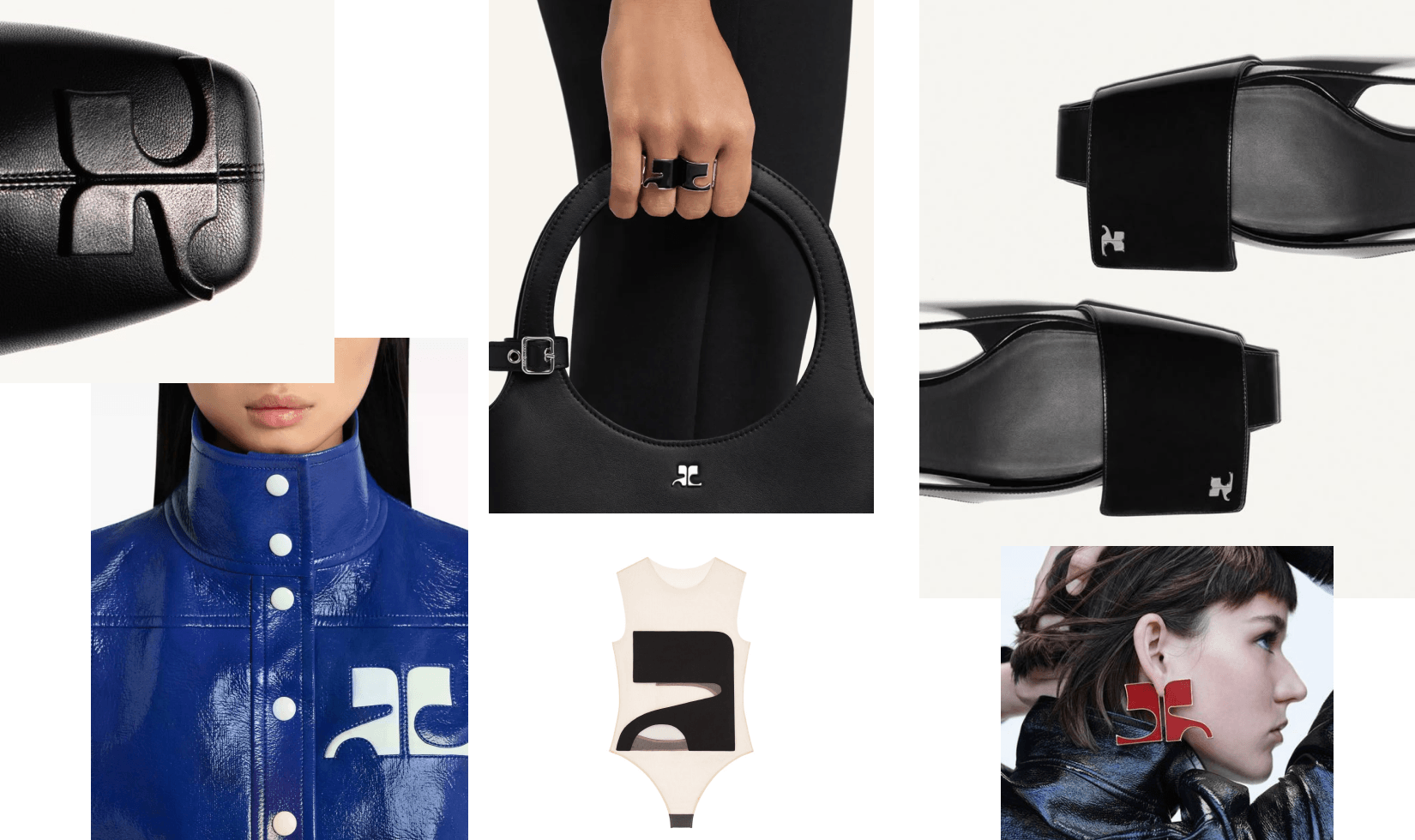
Some symbols don't need reinvention. They need conviction. The Courrèges symbol, created in 1965, still feels unexpectedly modern today. Not because it follows trends, but because it never tried to. It's slightly strange. Slightly futuristic. Not perfectly resolved in a classical sense. And that's exactly where its strength sits.
Unlike more "functional" symbols, it isn't particularly flexible. It doesn't naturally become a repeat pattern. It's not the easiest to scale across categories. But it doesn't need to be. Its power comes from something else entirely — a kind of visual stubbornness. It's almost awkward. Almost wrong. Almost too much. That tension makes it memorable.

Wearing it becomes a quiet signal. Not obvious status, not mass recognition. More of an if you know, you know moment. The lesson here isn't about versatility. It's about character. A symbol doesn't always need to be easy to use or endlessly adaptable. Sometimes being a little strange is exactly what makes it last.
Diesel: from symbol to attitude
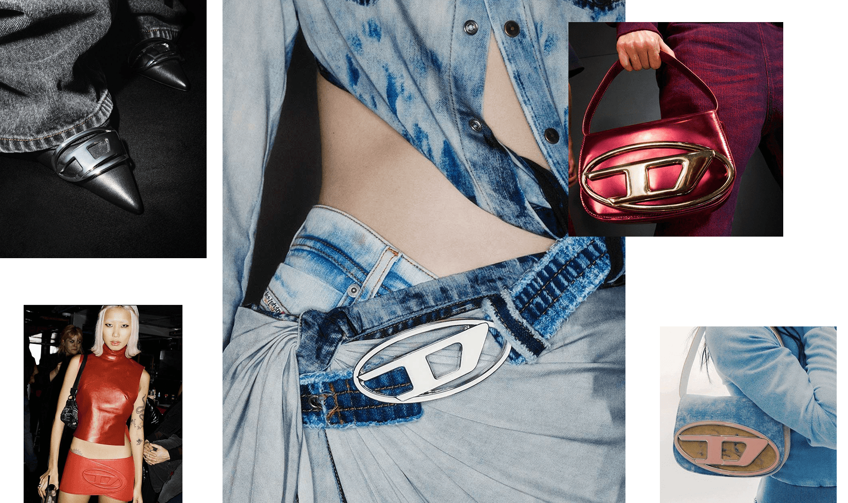
Diesel’s recent evolution shows another dimension of symbolic power. Under Glenn Martens, Diesel didn't just update its identity. It amplified it. The Oval D became a central visual asset, but what made it powerful wasn't the design alone. It was how aggressively it was used. Oversized placements. Metallic hardware. Cut-outs. Embellishments. Rhinestones. The symbol wasn’t printed but constructed into the garment. And they weren’t afraid to make it huge, to make it feel sexy.
Hard Data: in Q2 2022, when the new symbol was launched, Lyst said Diesel jumped six places in the hottest-brand ranking, the 1DR bag became the hottest women’s product in the world, and demand for it rose 317% in June alone. Official Diesel pages repeatedly describe the 1DR as iconic, signature, and instantly recognizable because of the Oval D hardware.
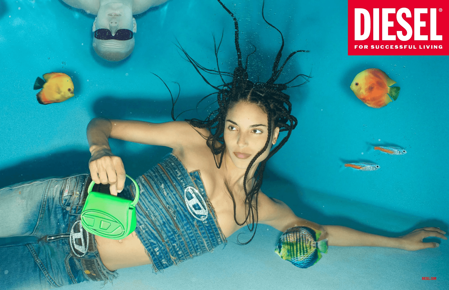
There’s also a cultural flip that followed. Diesel used to sit in slightly “dad-brand” territory. Familiar, a bit outdated, easy to overlook. Then suddenly it became the thing. The kind of brand people chase. You can see it in the volume of fakes being produced, to the point where, for some people, the goal isn’t even the Diesel product anymore, but the sign itself. When a symbol gets that desirable, it starts living its own life.
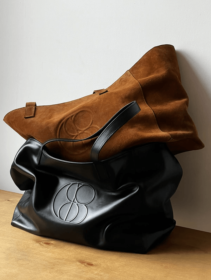
Coosh: when the symbol becomes a system
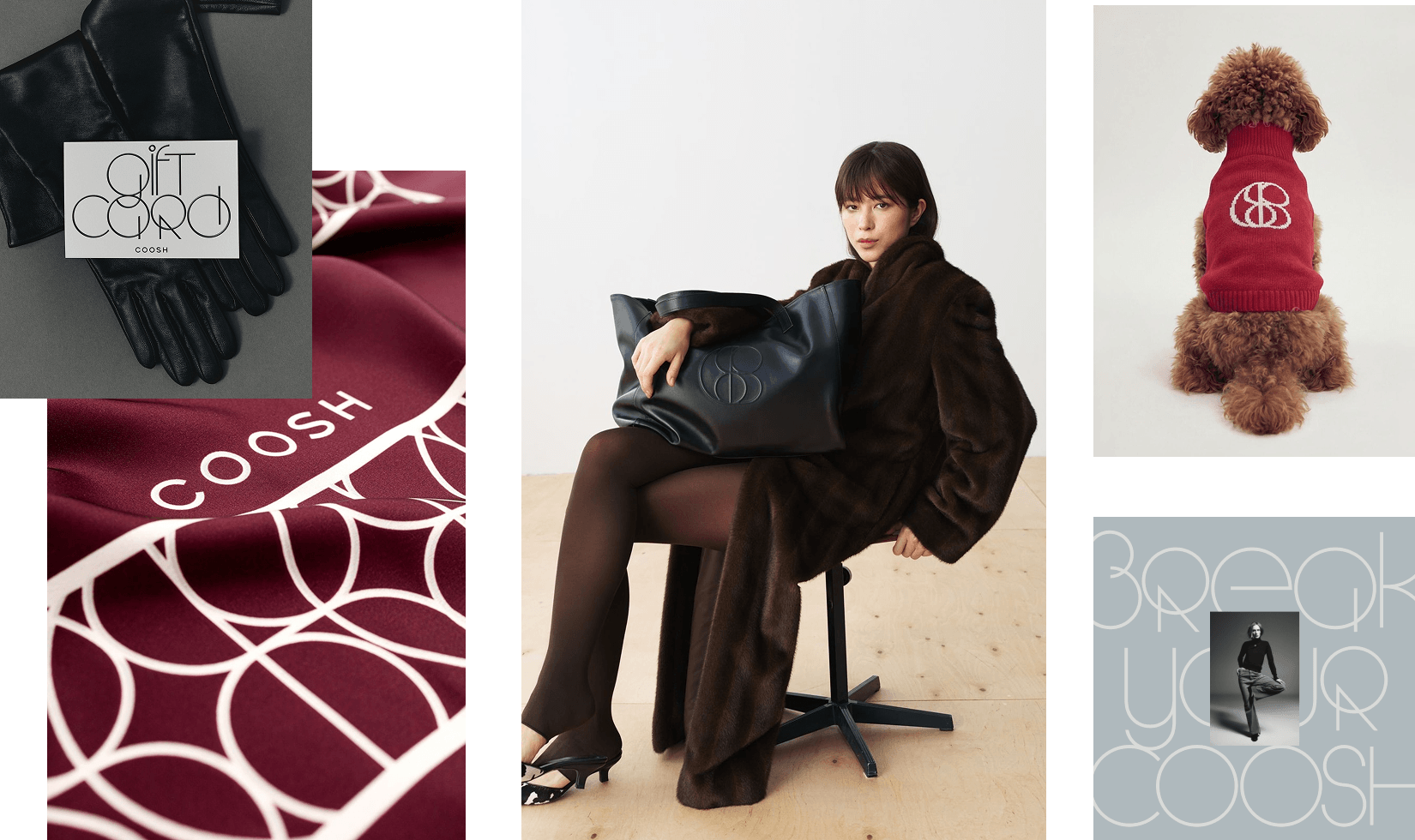
Some marks are designed to sit on a product. Others are designed to grow into an entire visual language. Coosh is the second kind.
When the brand came to Orchidea, the brief was clear: build an emblem strong enough to become a recognition engine. Something that could live as a metal clasp on a coat, an embossed detail on a knit, and a full-bleed pattern on tissue paper, without losing itself. The answer came from modernist geometry: simple, clean, endlessly scalable.
But the real design decision happened after the emblem. The geometry of the mark was precise enough to push the entire identity forward. A geometric typeface was brought in to extend the same logic, so even in layouts where the mark doesn't appear, the brand is still present. The symbol didn't just represent Coosh. It generated it.
Common mistake is building a symbol that lives in isolation. Brands design a beautiful mark, place it in a corner, and call it done.
What Coosh demonstrates is a different logic: the symbol as a seed. Its geometry generates the pattern system. Its proportions inform the type choices. Its logic carries from an 8mm woven tag to a billboard, without needing to be redesigned each time.
Strategic Pattern:
Across all five examples, one pattern becomes clear. A symbol grows into a cultural code only when the brand is willing to use it boldly. Not safely, not occasionally, not as decoration. As a core language. Loewe experiments relentlessly with form and material. Marine Serre pushed repetition to the edge of excess. Diesel made theirs oversized, sexy, and impossible to miss. Courrèges made theirs strange enough to be unforgettable. In each case, the symbol isn't just present — it's activated. A symbol alone doesn't create value. What creates value is how far a brand is willing to take it.
Designing a symbol is the first step. Most brands stop there — clean, balanced, “safe.” But symbols don’t become valuable just because they are well-designed. They become valuable because they are used with intent.
What separates a recognizable symbol from a cultural code is execution: scale, repetition, placement, and attitude. This is where most brands hesitate. They dilute, minimize, “make it tasteful.” And in doing so, they strip the symbol of its power.
.png)
In symbol territory, restraint is rarely the strategy. Distinctiveness is. The brands that win are the ones willing to push past comfort — to be slightly too bold, slightly too strange, slightly too much. Because memorability doesn’t come from perfection. It comes from tension. And if your symbol doesn’t create a reaction, it won’t create demand.
April 29, 2026
.png)